iAlert for Telematics & Fleet Management
Ashok Leyland recognized the need to develop a standalone mobile app for their telematics and fleet management platform, iAlert, as users often required access on the go, and the existing web app had limitations in responsiveness. This project was also seen as the first step towards progressively enhancing the new version of iAlert webapp.
Client:
Ashok Leyland
Role:
UX/UI Designer
Year:
2019
Duration:
6 months
Client:
Ashok Leyland
Role:
UX/UI Designer
Duration:
6 months
Year:
2019
Who, What and Why
Who are the users?
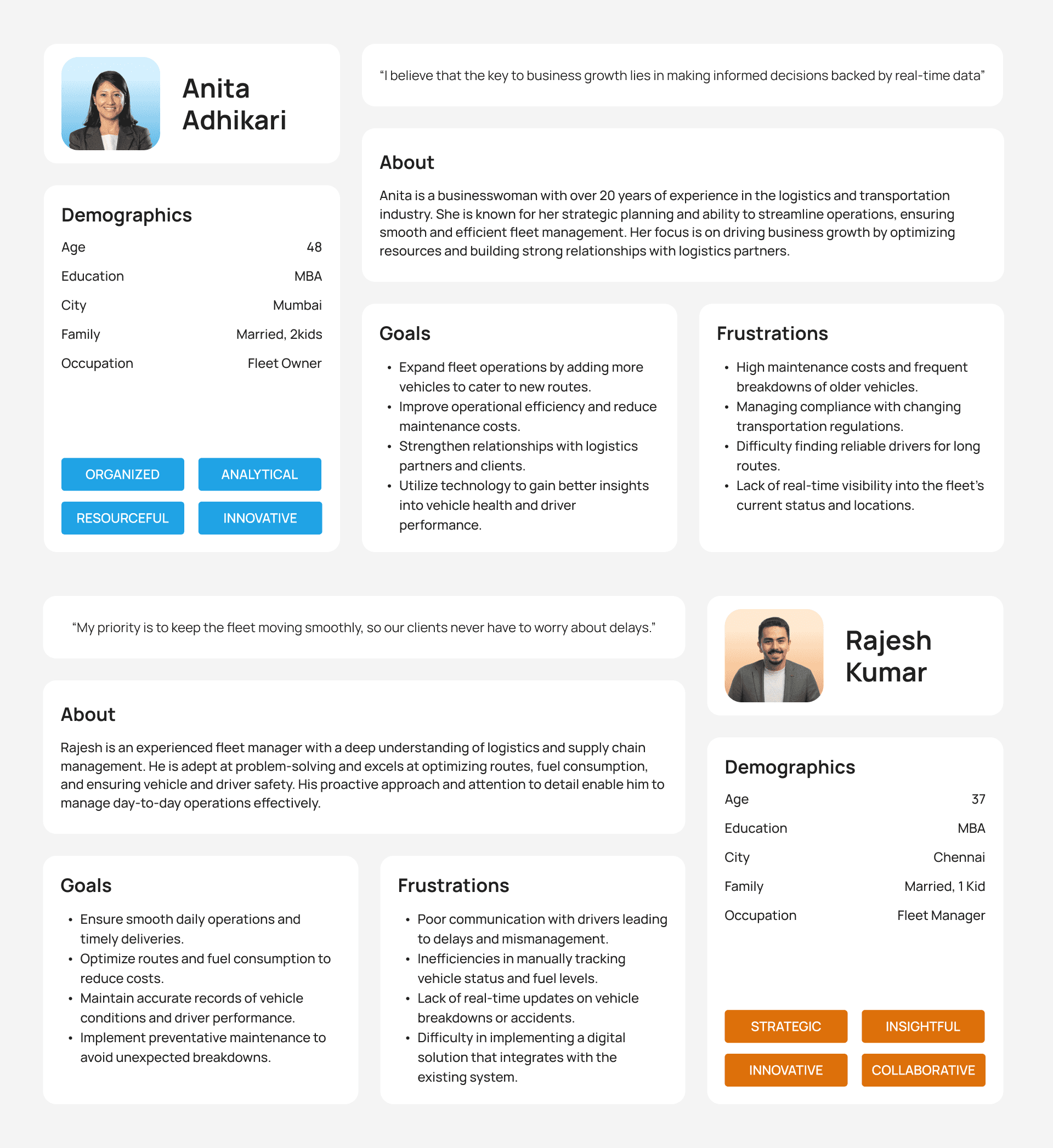
Fleet managers and owners who are responsible for overseeing and managing a company's fleet of vehicles. Their primary goal is to ensure the efficient operation, maintenance, and utilization of vehicles to meet business objectives.
Who are the users?
Fleet managers and owners who are responsible for overseeing and managing a company's fleet of vehicles. Their primary goal is to ensure the efficient operation, maintenance, and utilization of vehicles to meet business objectives.
Who are the users?
Fleet managers and owners who are responsible for overseeing and managing a company's fleet of vehicles. Their primary goal is to ensure the efficient operation, maintenance, and utilization of vehicles to meet business objectives.
What are user goals?
To oversee vehicle operations, ensuring maintenance, and cost efficiency. To optimize routes, manage drivers, track performance using telematics, and analyze data to improve efficiency. Also, to handle vehicle procurement and safety.
What are user goals?
To oversee vehicle operations, ensuring maintenance, and cost efficiency. To optimize routes, manage drivers, track performance using telematics, and analyze data to improve efficiency. Also, to handle vehicle procurement and safety.
What are user goals?
To oversee vehicle operations, ensuring maintenance, and cost efficiency. To optimize routes, manage drivers, track performance using telematics, and analyze data to improve efficiency. Also, to handle vehicle procurement and safety.
Who are the users?
Fleet managers and owners who are responsible for overseeing and managing a company's fleet of vehicles. Their primary goal is to ensure the efficient operation, maintenance, and utilization of vehicles to meet business objectives.
What are user goals?
To oversee vehicle operations, ensuring maintenance, and cost efficiency. To optimize routes, manage drivers, track performance using telematics, and analyze data to improve efficiency. Also, to handle vehicle procurement and safety.
Why design iAlert app?
Users relied solely on the web app version of iAlert, which increased the risk of missing alerts. To enhance fleet management efficiency, we needed to design a mobile version of iAlert for on-the-go access. Additionally, the web app redesign with new features was also in the pipeline, so we adopted a mobile-first approach.
Challenges
Due to data-driven nature of iAlert, many pages features repetitive rows of data which gave a monotonous look and feel. Striking a balance between usability, informativeness, and a delightful experience was challenging.
Challenges
Due to data-driven nature of iAlert, many pages features repetitive rows of data which gave a monotonous look and feel. Striking a balance between usability, informativeness, and a delightful experience was challenging.
Challenges
Due to data-driven nature of iAlert, many pages features repetitive rows of data which gave a monotonous look and feel. Striking a balance between usability, informativeness, and a delightful experience was challenging.
Why design iAlert app?
Users relied solely on the web app version of iAlert, which increased the risk of missing alerts. To enhance fleet management efficiency, we needed to design a mobile version of iAlert for on-the-go access. Additionally, the web app redesign with new features was also in the pipeline, so we adopted a mobile-first approach.
Challenges
Due to data-driven nature of iAlert, many pages features repetitive rows of data which gave a monotonous look and feel. Striking a balance between usability, informativeness, and a delightful experience was challenging.
Problem Discovery
Usability issues in the home page
Hierarchy of the features displayed in the home screen is not assigned properly. This causes user to spend more time to find what they need.
Hierarchy of the features displayed in the home screen is not assigned properly. This causes user to spend more time to find what they need.
Hierarchy of the features displayed in the home screen is not assigned properly. This causes user to spend more time to find what they need.
Hierarchy of the features displayed in the home screen is not assigned properly. This causes user to spend more time to find what they need.
Navigation adapted in the entire application is not scalable. New features incorporated in the applications are find scattered throughout the home page UI.
Navigation adapted in the entire application is not scalable. New features incorporated in the applications are find scattered throughout the home page UI.
Navigation adapted in the entire application is not scalable. New features incorporated in the applications are find scattered throughout the home page UI.
Navigation adapted in the entire application is not scalable. New features incorporated in the applications are find scattered throughout the home page UI.
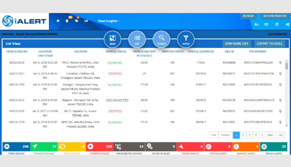
Limited access to volumes of data
Users access this list to extract telematics data of the vehicles. The list allows access to only limited set of data at a time.
List view of vehicles are not sorted in a useful order. Filtering the list item is not properly designed and it brings confusion to users.
Users access this list to extract telematics data of the vehicles. The list allows access to only limited set of data at a time.
Users access this list to extract telematics data of the vehicles. The list allows access to only limited set of data at a time.
Users can configure the lists and there are more than two set of filters which makes it complex and difficult to find the data.
Users can configure the data they wanted to see in list items. But at a time they can view only one set of data. Comparison of data and vehicles are impossible.
Users can configure the lists and there are more than two set of filters which makes it complex and difficult to find the data.
Users can configure the lists and there are more than two set of filters which makes it complex and difficult to find the data.
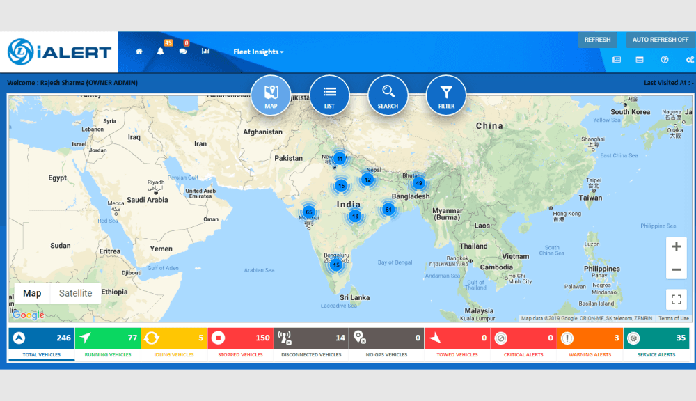
High click count to view the summary of fleet status
The home page consist mainly of the map and location of cluster of vehicles. Users have to click several times on each cluster to see alerts for each vehicles.
The home page consist mainly of the map and location of cluster of vehicles. Users have to click several times on each cluster to see alerts for each vehicles.
The home page consist mainly of the map and location of cluster of vehicles. Users have to click several times on each cluster to see alerts for each vehicles.
The home page consist mainly of the map and location of cluster of vehicles. Users have to click several times on each cluster to see alerts for each vehicles.
Also home page loads slowly mainly due to the amount of data needed to load the map and location of fleet clusters.
Also home page loads slowly mainly due to the amount of data needed to load the map and location of fleet clusters.
Also home page loads slowly mainly due to the amount of data needed to load the map and location of fleet clusters.
Also home page loads slowly mainly due to the amount of data needed to load the map and location of fleet clusters.
Ideation and Exploration
User Persona
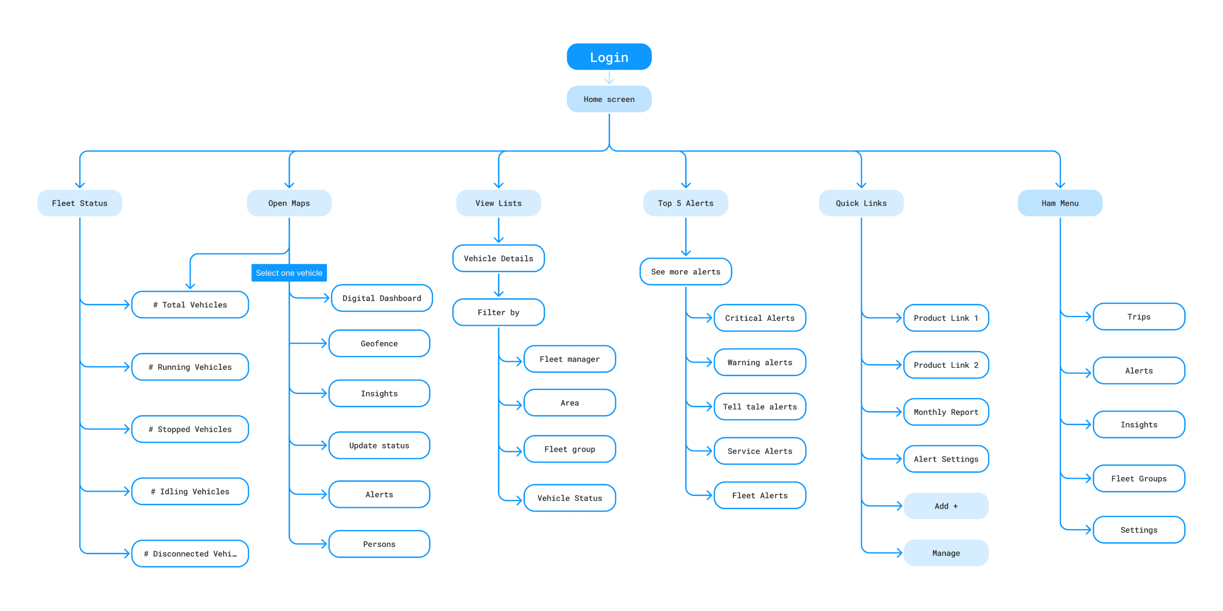
Information Architecture
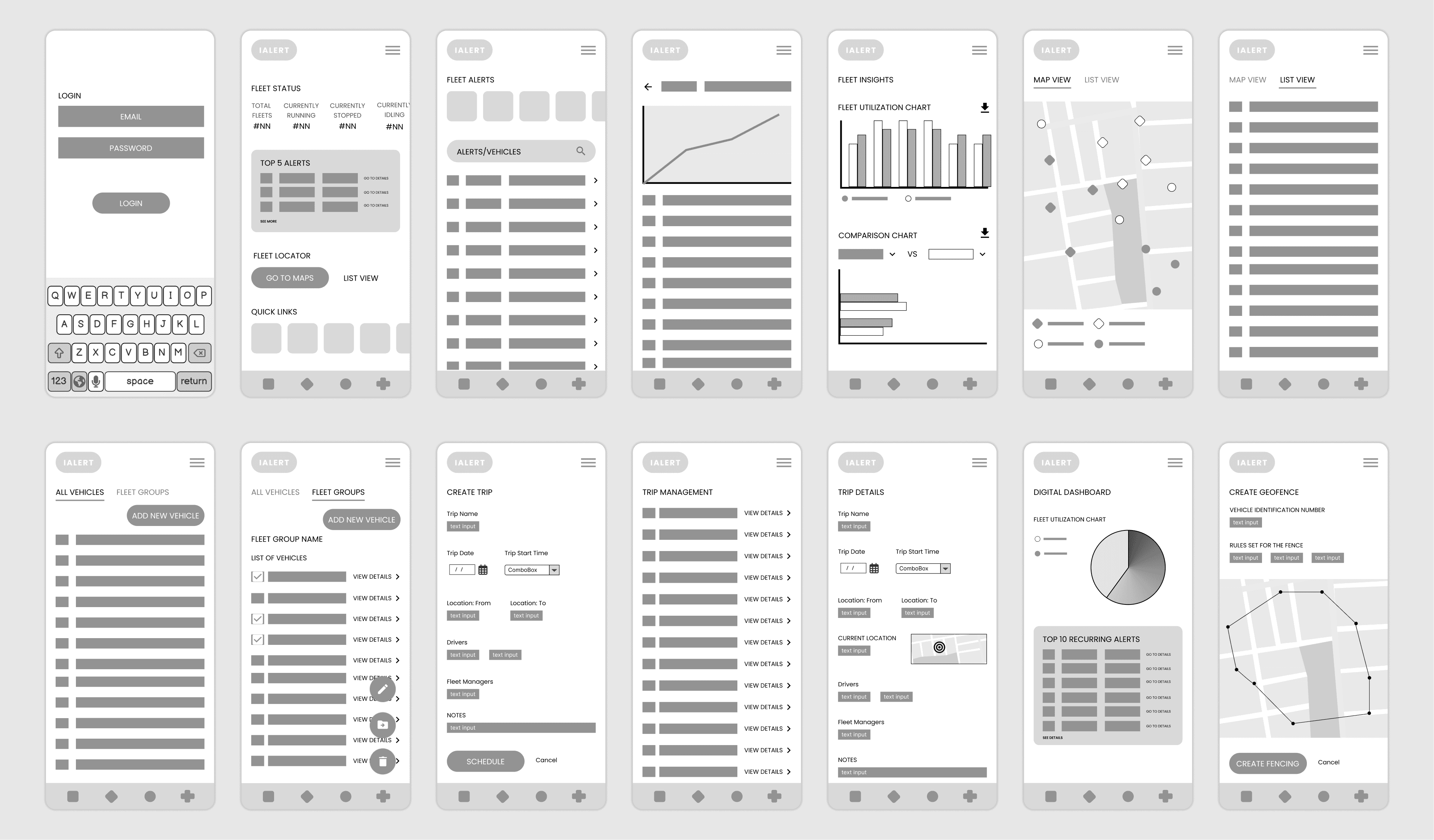
Wireframes
Final Design Outcomes
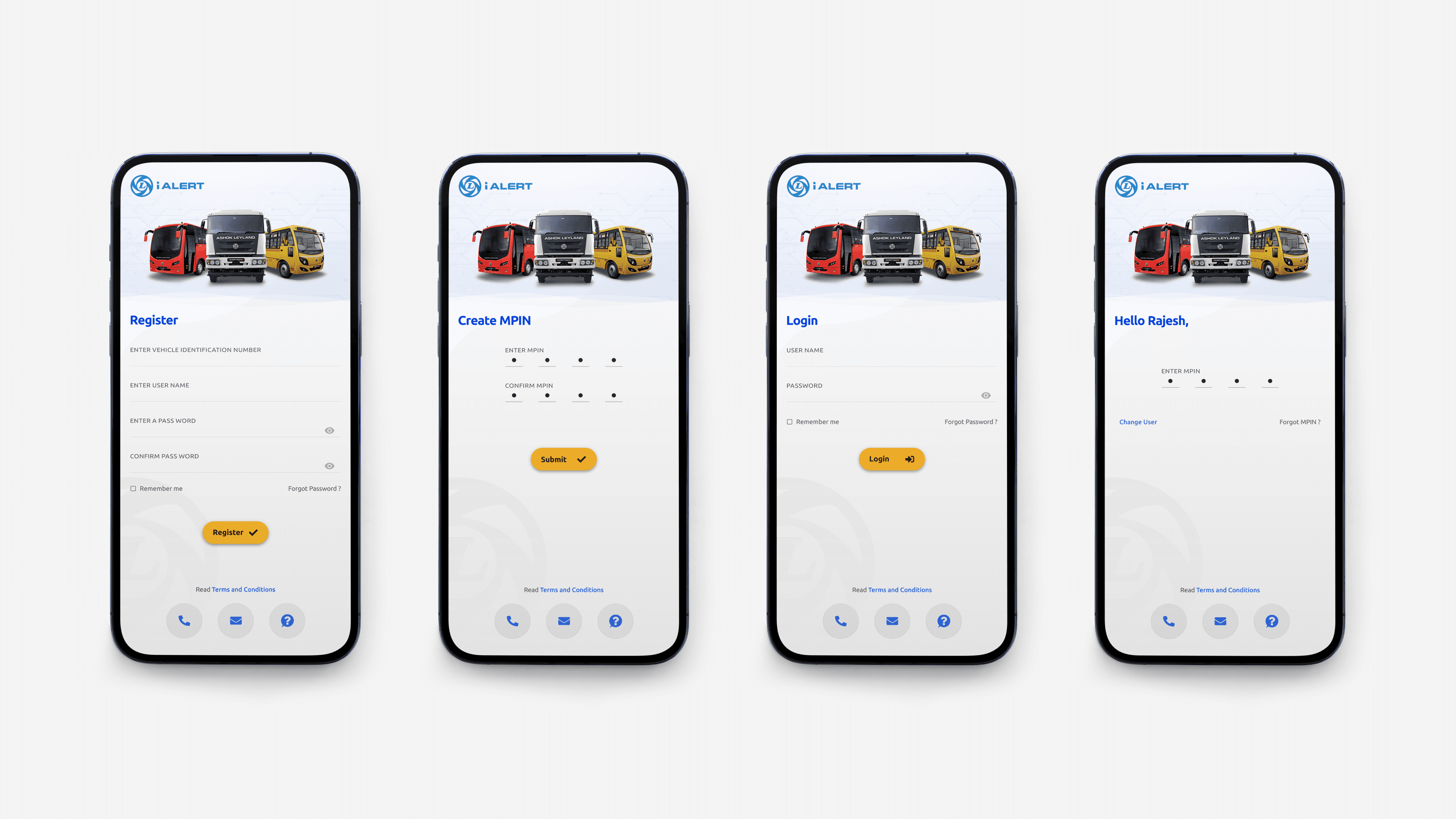
User registration and login screens
Redesigned the signup/sign-in process to minimize user effort by reducing unnecessary steps and ensuring intuitive interactions. This approach enhances accessibility and enables users to seamlessly begin using the app without confusion or delays.
Redesigned the signup/sign-in process to minimize user effort by reducing unnecessary steps and ensuring intuitive interactions. This approach enhances accessibility and enables users to seamlessly begin using the app without confusion or delays.
Redesigned the signup/sign-in process to minimize user effort by reducing unnecessary steps and ensuring intuitive interactions. This approach enhances accessibility and enables users to seamlessly begin using the app without confusion or delays.
Redesigned the signup/sign-in process to minimize user effort by reducing unnecessary steps and ensuring intuitive interactions. This approach enhances accessibility and enables users to seamlessly begin using the app without confusion or delays.
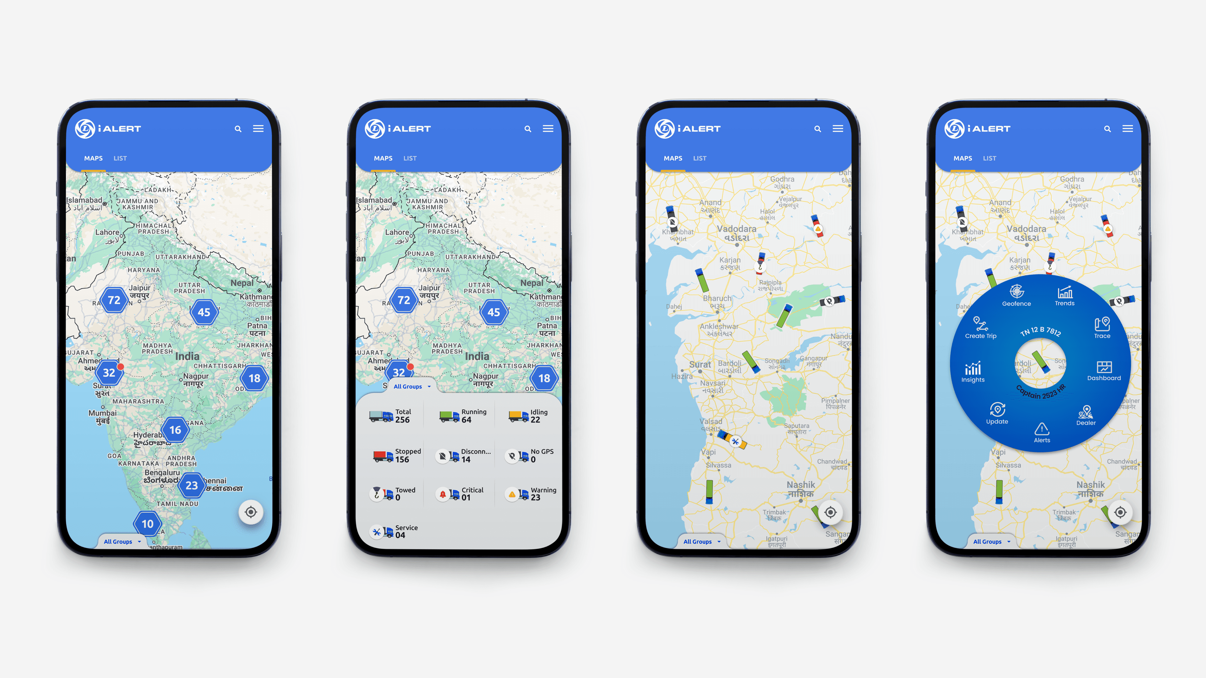
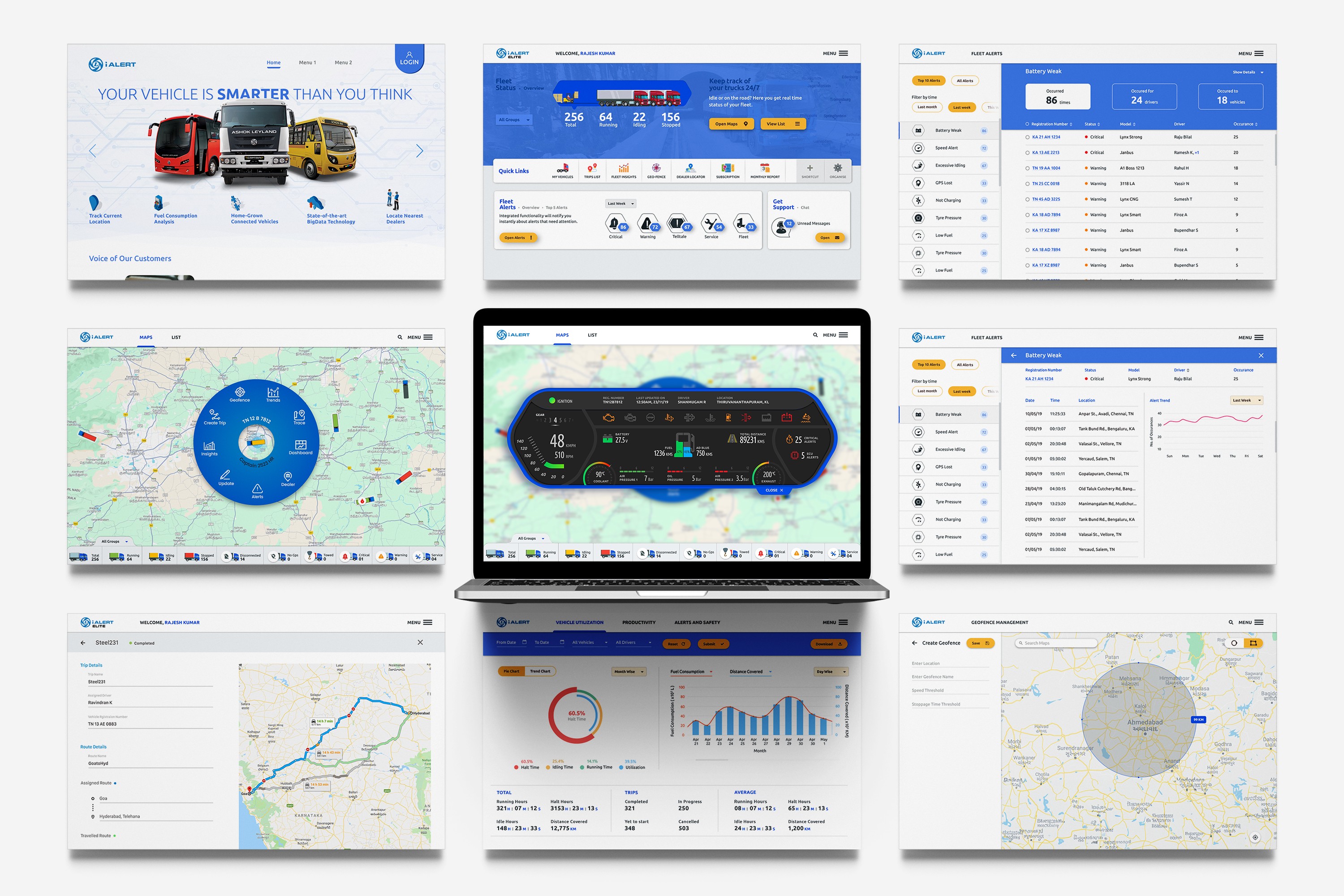
Home Screen
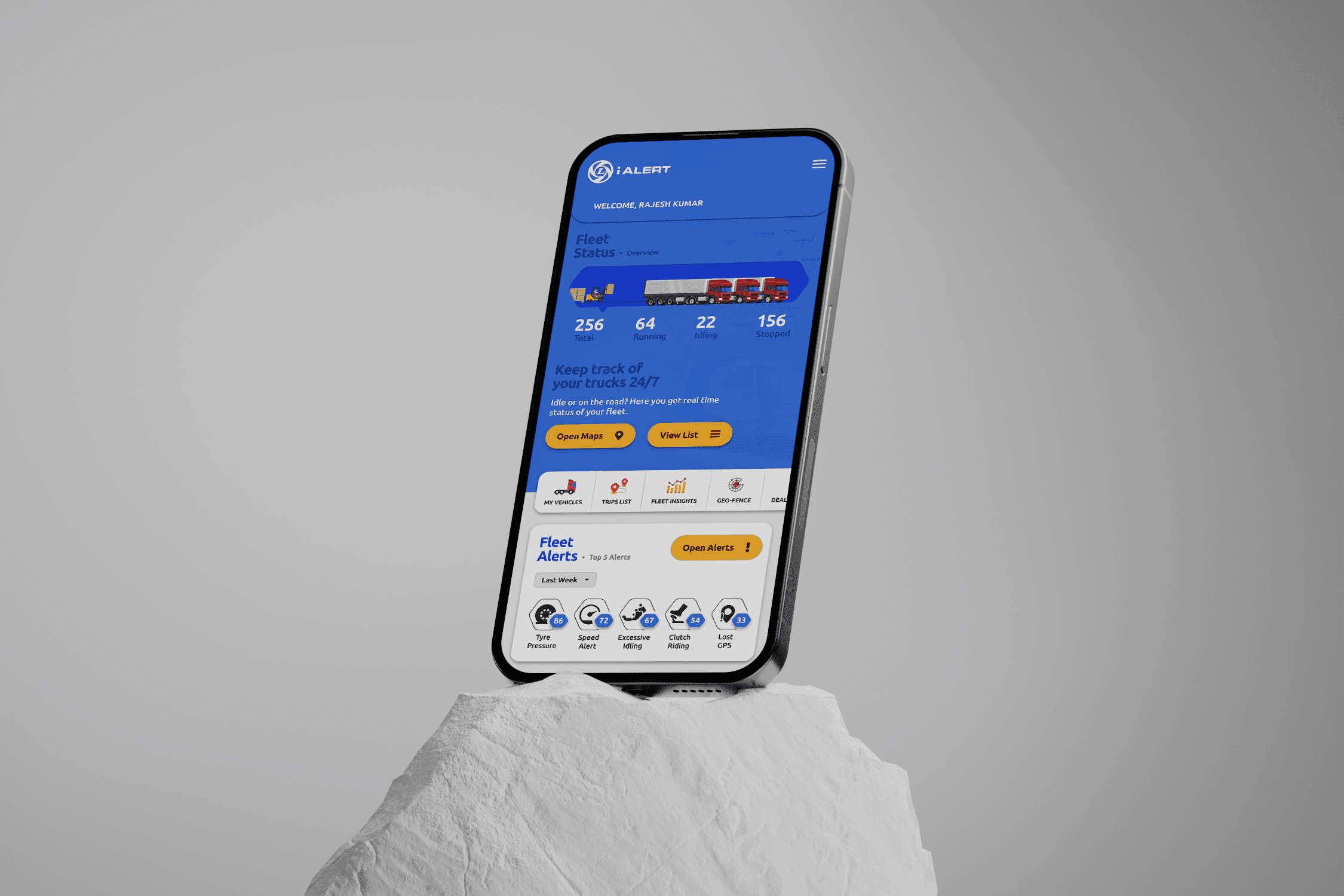
We replaced the initial map view with a home screen that provides an instant fleet status overview, key fleet details, and customizable quick links. This update reduces delays and minimizes clicks, offering a more efficient and user-friendly experience.
We replaced the initial map view with a home screen that provides an instant fleet status overview, key fleet details, and customizable quick links. This update reduces delays and minimizes clicks, offering a more efficient and user-friendly experience.
We replaced the initial map view with a home screen that provides an instant fleet status overview, key fleet details, and customizable quick links. This update reduces delays and minimizes clicks, offering a more efficient and user-friendly experience.
We replaced the initial map view with a home screen that provides an instant fleet status overview, key fleet details, and customizable quick links. This update reduces delays and minimizes clicks, offering a more efficient and user-friendly experience.
To enhance the user experience, we added minimalistic animations and unique design elements to the home screen. This transformed it into a visually engaging interface, replacing monotonous data rows with a more enjoyable and interactive experience.
To enhance the user experience, we added minimalistic animations and unique design elements to the home screen. This transformed it into a visually engaging interface, replacing monotonous data rows with a more enjoyable and interactive experience.
To enhance the user experience, we added minimalistic animations and unique design elements to the home screen. This transformed it into a visually engaging interface, replacing monotonous data rows with a more enjoyable and interactive experience.
To enhance the user experience, we added minimalistic animations and unique design elements to the home screen. This transformed it into a visually engaging interface, replacing monotonous data rows with a more enjoyable and interactive experience.
Positioning fleets on the map
We adapted the existing map view design from the web app with minimal yet impactful changes to ensure optimal usability on smaller screens. Labels were added to vehicles with alerts, providing users with clear context and a better understanding of ongoing events.
We adapted the existing map view design from the web app with minimal yet impactful changes to ensure optimal usability on smaller screens. Labels were added to vehicles with alerts, providing users with clear context and a better understanding of ongoing events.
We adapted the existing map view design from the web app with minimal yet impactful changes to ensure optimal usability on smaller screens. Labels were added to vehicles with alerts, providing users with clear context and a better understanding of ongoing events.
We adapted the existing map view design from the web app with minimal yet impactful changes to ensure optimal usability on smaller screens. Labels were added to vehicles with alerts, providing users with clear context and a better understanding of ongoing events.
We introduced an interactive dial that appears when users click on a vehicle. This feature provides quick access to a set of essential links, offering detailed information about the vehicle's status and performance for a more informed user experience.
We introduced an interactive dial that appears when users click on a vehicle. This feature provides quick access to a set of essential links, offering detailed information about the vehicle's status and performance for a more informed user experience.
We introduced an interactive dial that appears when users click on a vehicle. This feature provides quick access to a set of essential links, offering detailed information about the vehicle's status and performance for a more informed user experience.
We introduced an interactive dial that appears when users click on a vehicle. This feature provides quick access to a set of essential links, offering detailed information about the vehicle's status and performance for a more informed user experience.
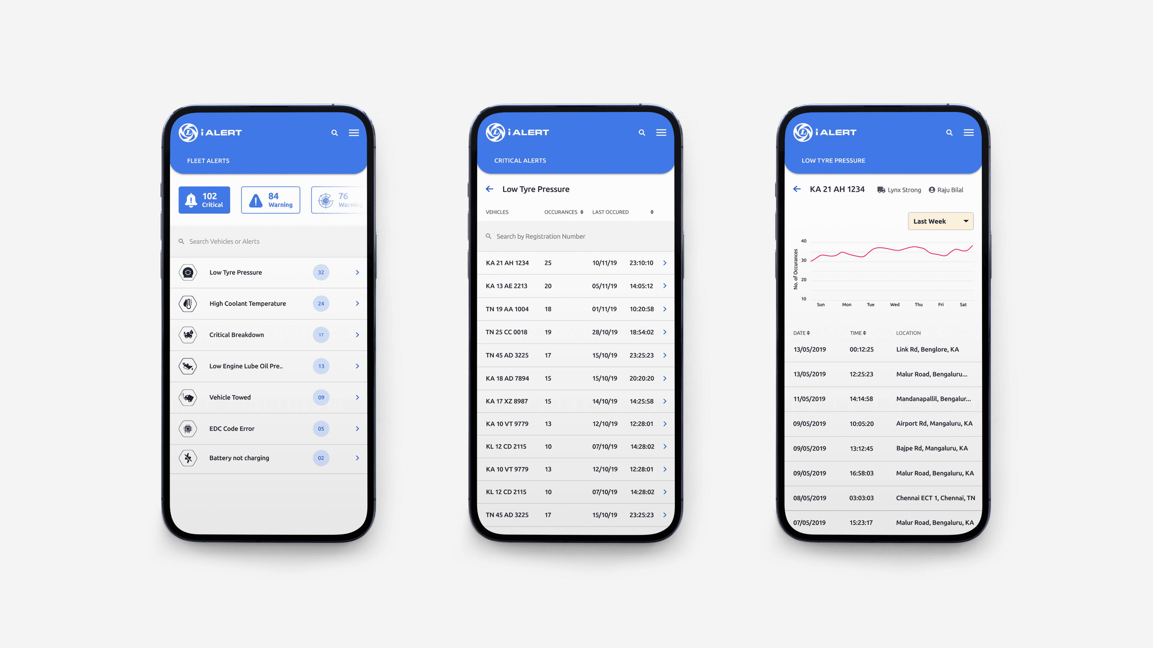
Fleet alerts and details page
Fleet alerts contain a large amount of data on unexpected events, taking up significant space on the web app. To adapt this for smaller screens, we prioritized key information and split the details into three screens. This redesign allows users to explore the content with minimal clicks, ensuring better usability.
Fleet alerts contain a large amount of data on unexpected events, taking up significant space on the web app. To adapt this for smaller screens, we prioritized key information and split the details into three screens. This redesign allows users to explore the content with minimal clicks, ensuring better usability.
Fleet alerts contain a large amount of data on unexpected events, taking up significant space on the web app. To adapt this for smaller screens, we prioritized key information and split the details into three screens. This redesign allows users to explore the content with minimal clicks, ensuring better usability.
Fleet alerts contain a large amount of data on unexpected events, taking up significant space on the web app. To adapt this for smaller screens, we prioritized key information and split the details into three screens. This redesign allows users to explore the content with minimal clicks, ensuring better usability.
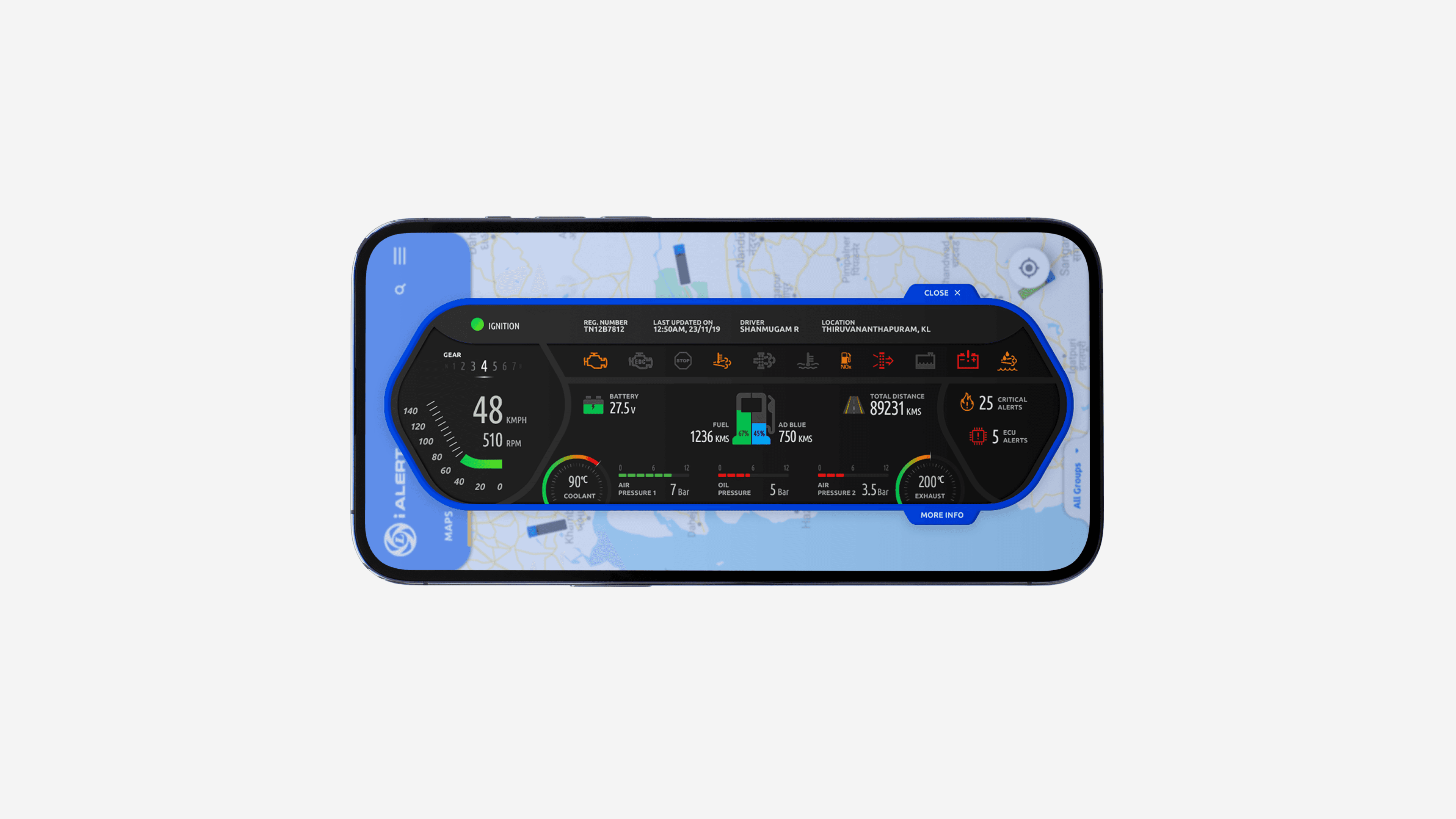
Vehicle Digital Dashboard
The digital dashboard is a virtual replica of the vehicle's dashboard, accessible through the app. It allows users to monitor driver behavior in real time and view warning lights (tell-tale lights), providing crucial insights into the vehicle's health and performance.
The digital dashboard is a virtual replica of the vehicle's dashboard, accessible through the app. It allows users to monitor driver behavior in real time and view warning lights (tell-tale lights), providing crucial insights into the vehicle's health and performance.
The digital dashboard is a virtual replica of the vehicle's dashboard, accessible through the app. It allows users to monitor driver behavior in real time and view warning lights (tell-tale lights), providing crucial insights into the vehicle's health and performance.
The digital dashboard is a virtual replica of the vehicle's dashboard, accessible through the app. It allows users to monitor driver behavior in real time and view warning lights (tell-tale lights), providing crucial insights into the vehicle's health and performance.
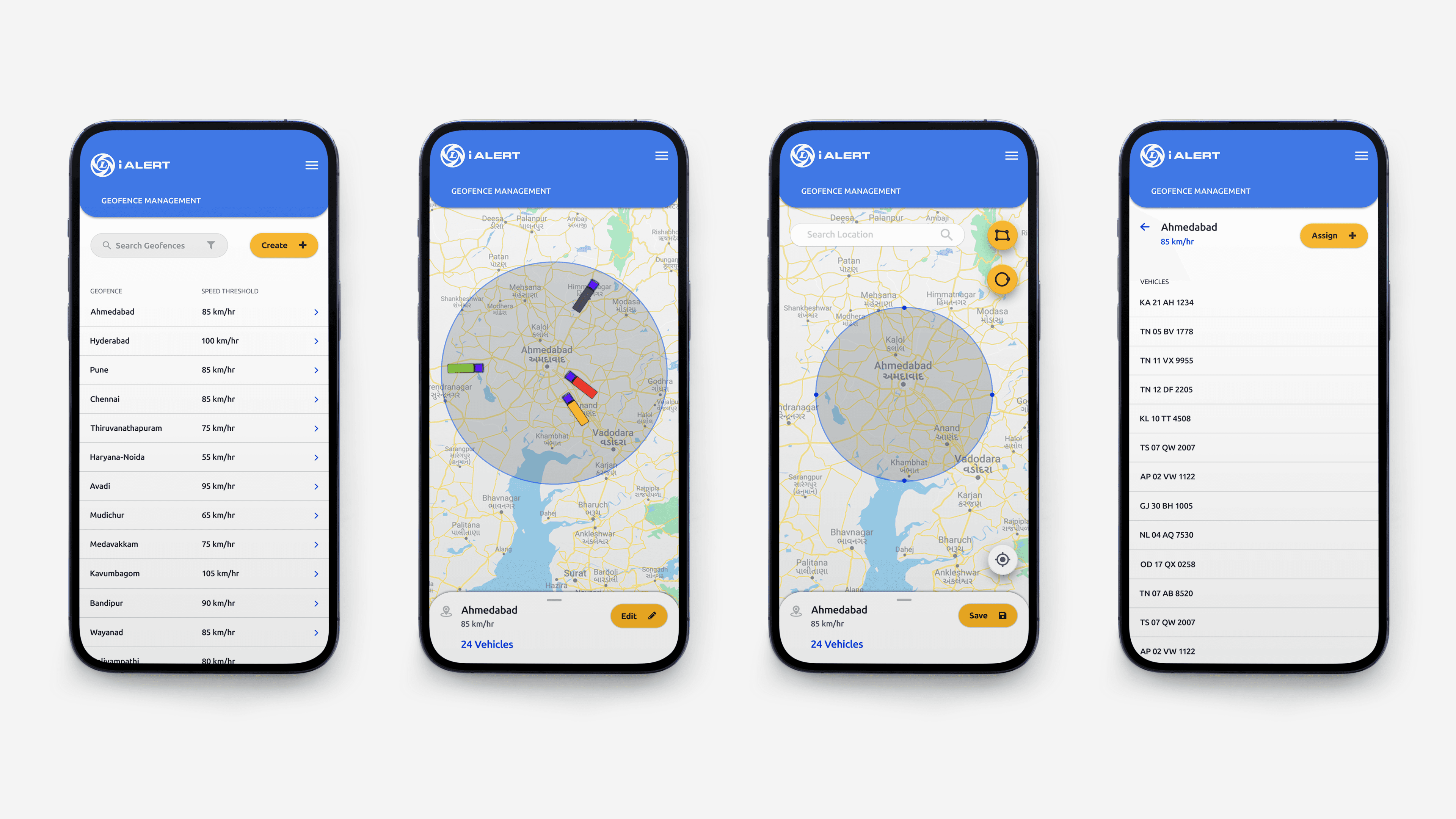
Geofencing Fleets
We replaced the initial map view with a home screen that provides an instant fleet status overview, key fleet details, and customizable quick links. This update reduces delays and minimizes clicks, offering a more efficient and user-friendly experience.
We replaced the initial map view with a home screen that provides an instant fleet status overview, key fleet details, and customizable quick links. This update reduces delays and minimizes clicks, offering a more efficient and user-friendly experience.
We replaced the initial map view with a home screen that provides an instant fleet status overview, key fleet details, and customizable quick links. This update reduces delays and minimizes clicks, offering a more efficient and user-friendly experience.
We replaced the initial map view with a home screen that provides an instant fleet status overview, key fleet details, and customizable quick links. This update reduces delays and minimizes clicks, offering a more efficient and user-friendly experience.
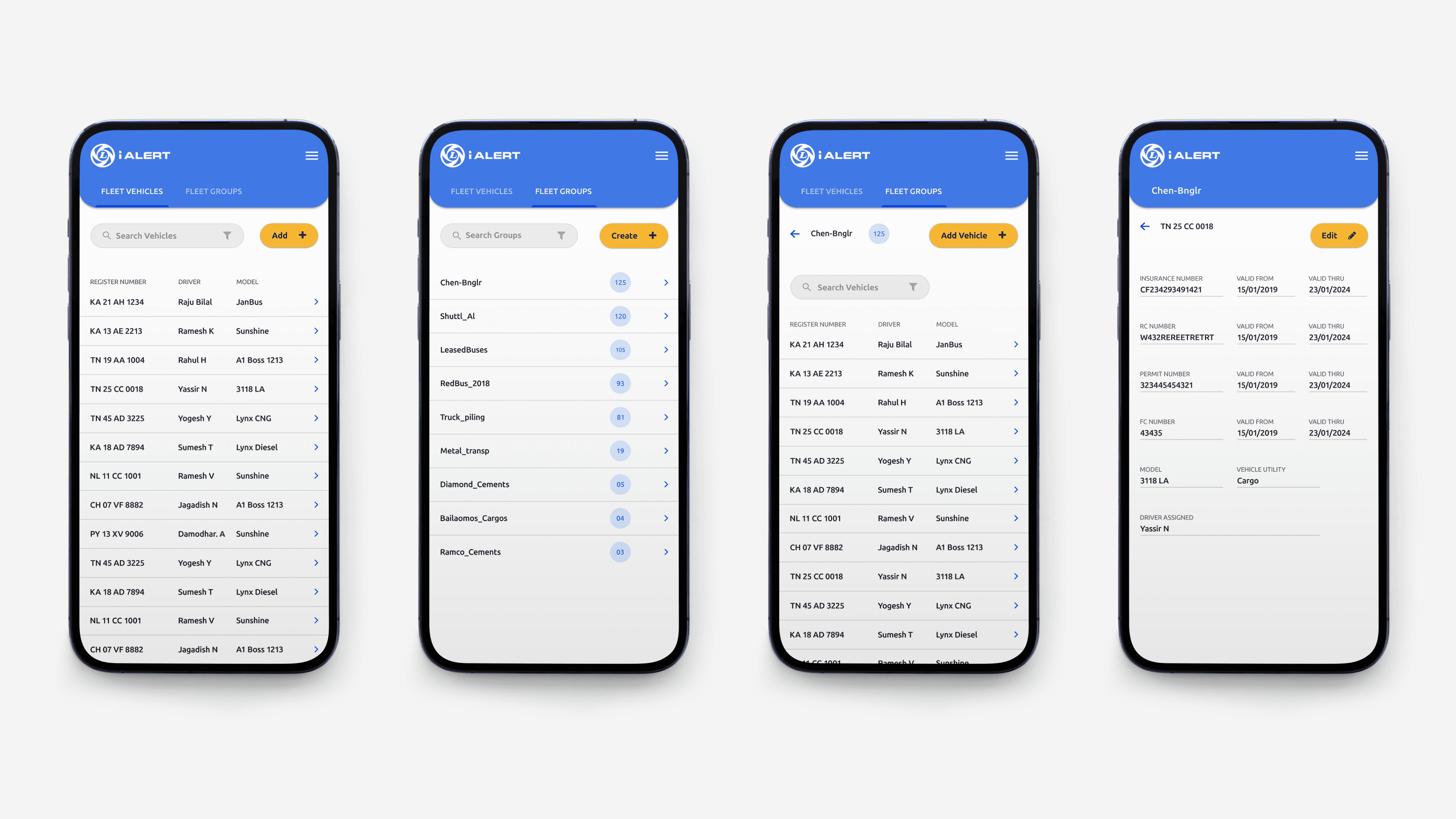
Fleet Management
This feature allows users to add vehicles, create and manage fleet groups, move vehicles between groups, assign vehicles to drivers, and view performance metrics. Fleet owners can also assign fleet groups to managers, providing greater control and flexibility in fleet management.
This feature allows users to add vehicles, create and manage fleet groups, move vehicles between groups, assign vehicles to drivers, and view performance metrics. Fleet owners can also assign fleet groups to managers, providing greater control and flexibility in fleet management.
This feature allows users to add vehicles, create and manage fleet groups, move vehicles between groups, assign vehicles to drivers, and view performance metrics. Fleet owners can also assign fleet groups to managers, providing greater control and flexibility in fleet management.
This feature allows users to add vehicles, create and manage fleet groups, move vehicles between groups, assign vehicles to drivers, and view performance metrics. Fleet owners can also assign fleet groups to managers, providing greater control and flexibility in fleet management.
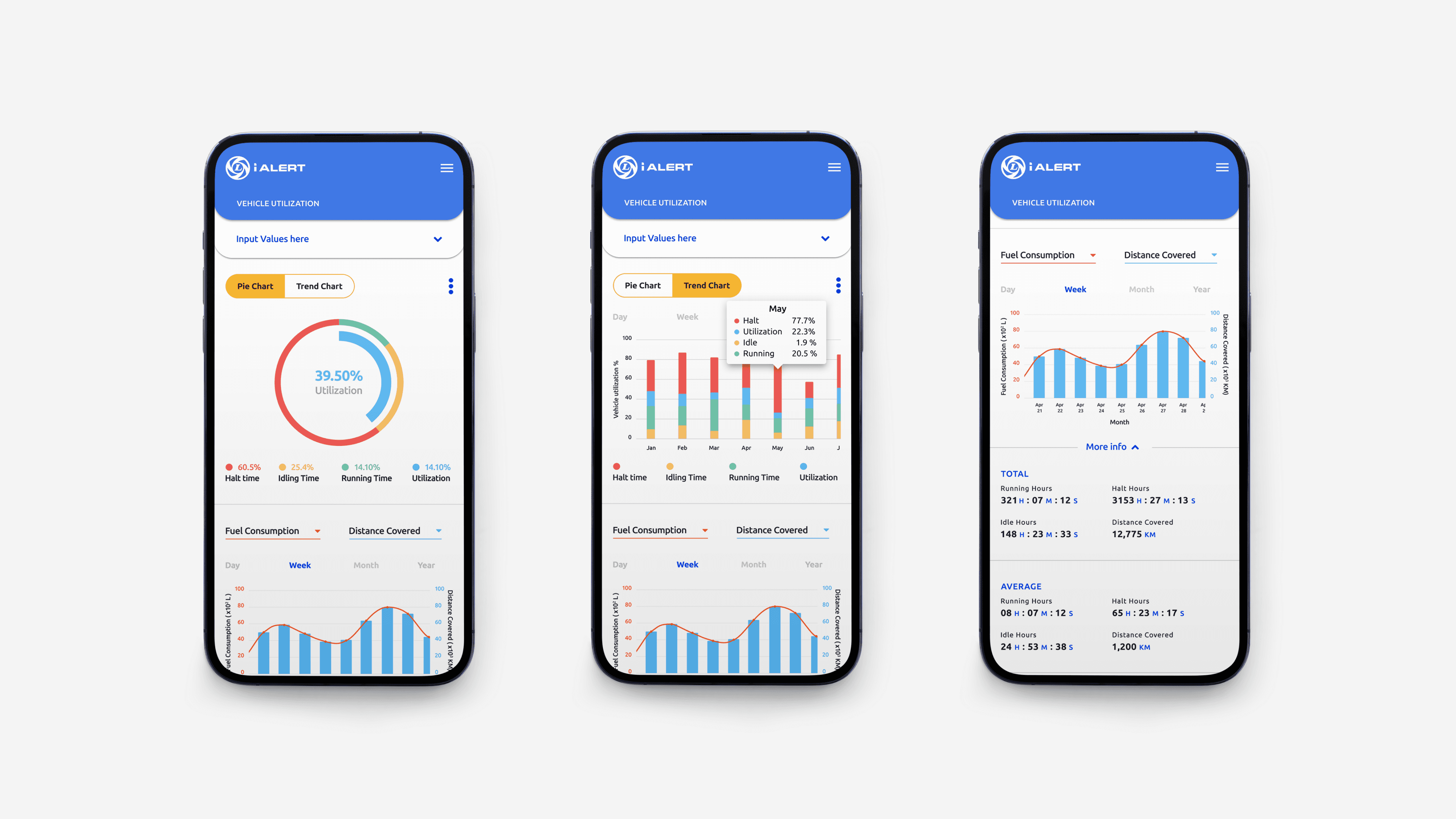
Fleet Insights
Fleet insights provide in-depth information about vehicle health and performance, displaying a range of customizable metrics tailored to the user's needs. This feature allows fleet owners to track and analyze key data for better decision-making and proactive fleet management.
Fleet insights provide in-depth information about vehicle health and performance, displaying a range of customizable metrics tailored to the user's needs. This feature allows fleet owners to track and analyze key data for better decision-making and proactive fleet management.
Fleet insights provide in-depth information about vehicle health and performance, displaying a range of customizable metrics tailored to the user's needs. This feature allows fleet owners to track and analyze key data for better decision-making and proactive fleet management.
Fleet insights provide in-depth information about vehicle health and performance, displaying a range of customizable metrics tailored to the user's needs. This feature allows fleet owners to track and analyze key data for better decision-making and proactive fleet management.
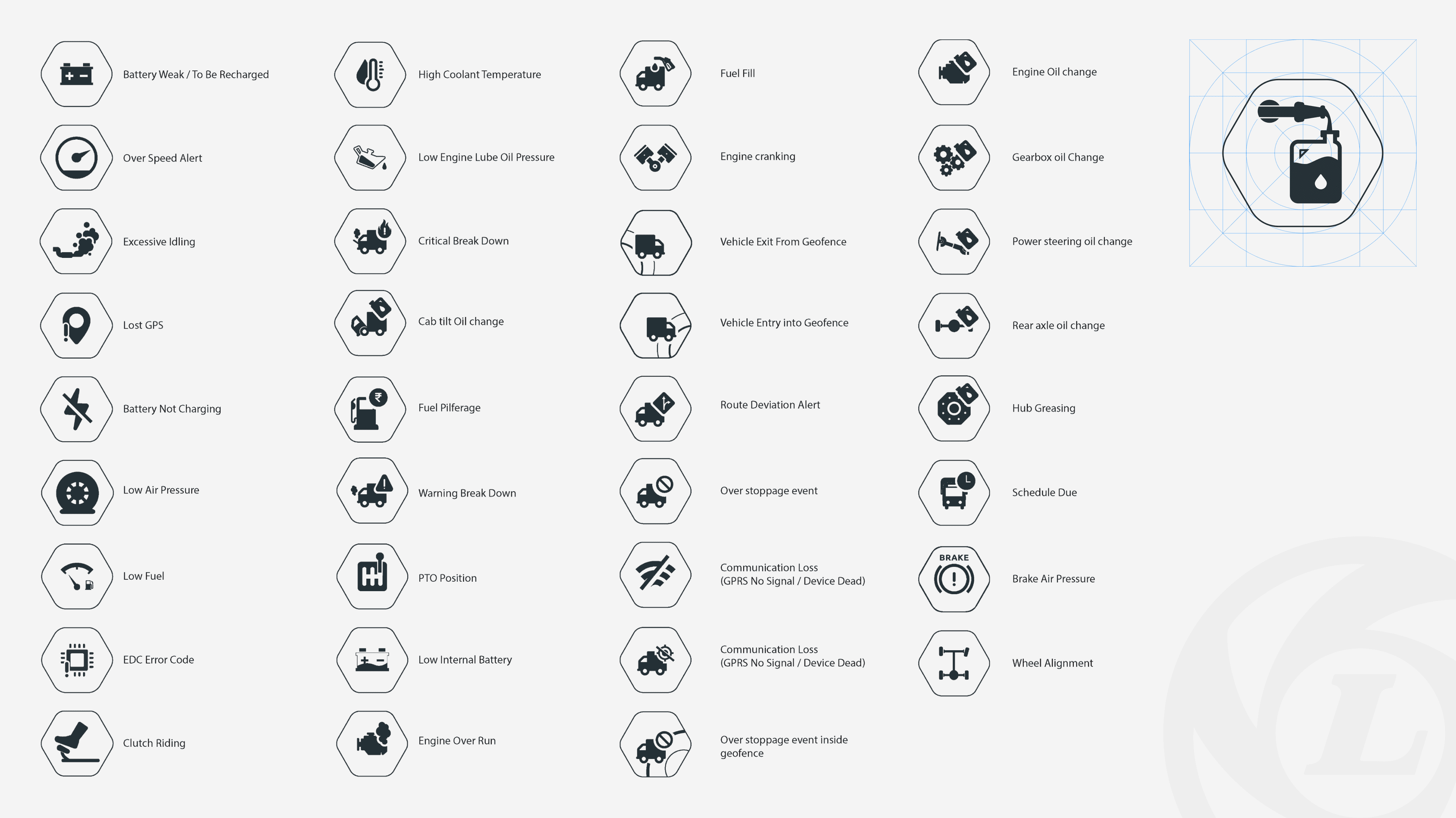
Custom iconography used for alerts
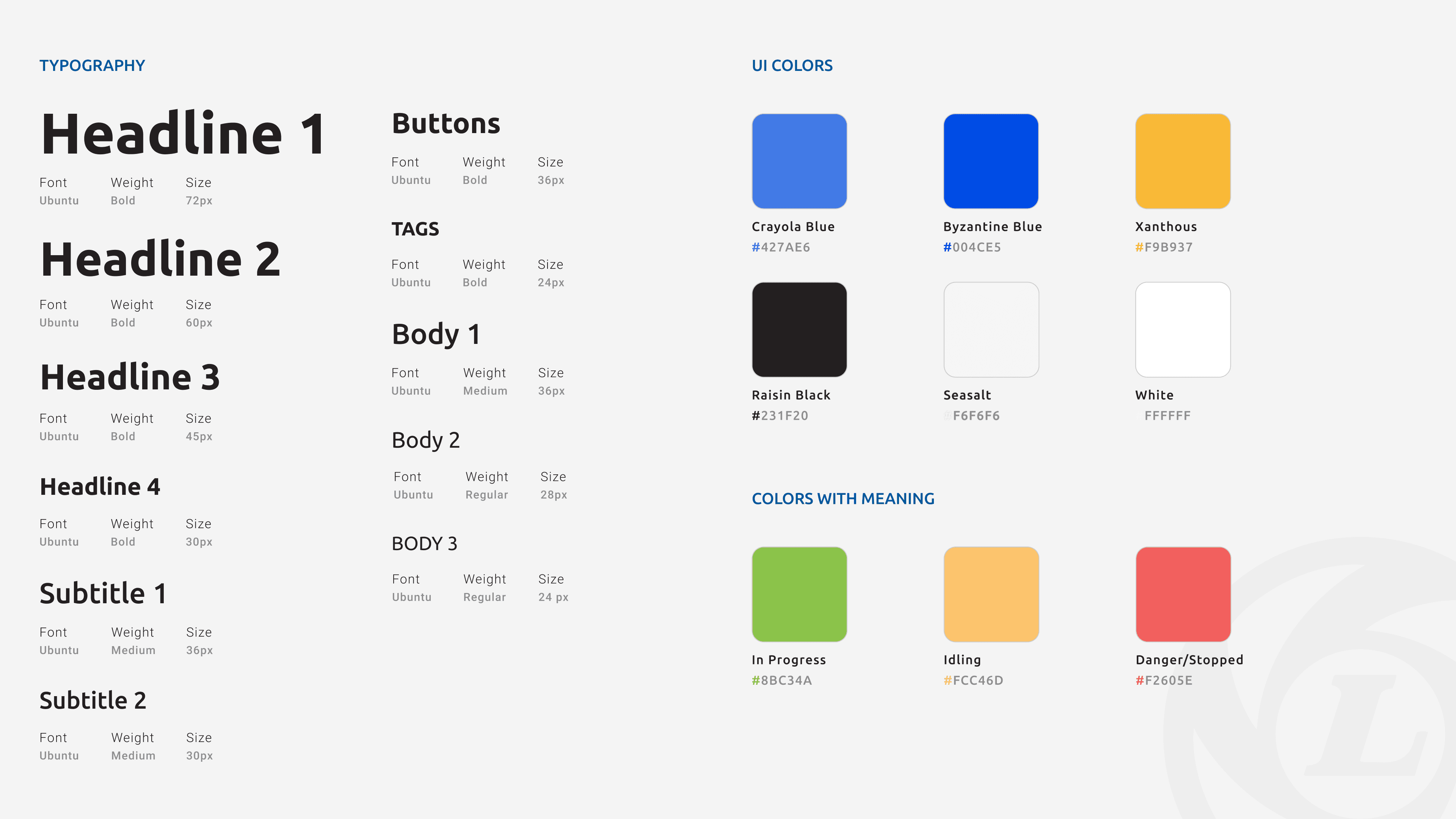
Typography and Colors
iAlert webapp designs
After designing a significant number of mobile screens, we shifted focus to the web app pages, aiming to provide a consistent user experience across both platforms. We ensured the web design mirrored the mobile experience, maintaining usability and functionality for web users.
After designing a significant number of mobile screens, we shifted focus to the web app pages, aiming to provide a consistent user experience across both platforms. We ensured the web design mirrored the mobile experience, maintaining usability and functionality for web users.
After designing a significant number of mobile screens, we shifted focus to the web app pages, aiming to provide a consistent user experience across both platforms. We ensured the web design mirrored the mobile experience, maintaining usability and functionality for web users.
After designing a significant number of mobile screens, we shifted focus to the web app pages, aiming to provide a consistent user experience across both platforms. We ensured the web design mirrored the mobile experience, maintaining usability and functionality for web users.
Impact of the new design
Over 60,000 customers managing 1.5M+ vehicles have adopted iALERT connected vehicle, leading to better conversion rates and efficiency.
Over 60,000 customers managing 1.5M+ vehicles have adopted iALERT connected vehicle, leading to better conversion rates and efficiency.
Over 60,000 customers managing 1.5M+ vehicles have adopted iALERT connected vehicle, leading to better conversion rates and efficiency.
Over 60,000 customers managing 1.5M+ vehicles have adopted iALERT connected vehicle, leading to better conversion rates and efficiency.
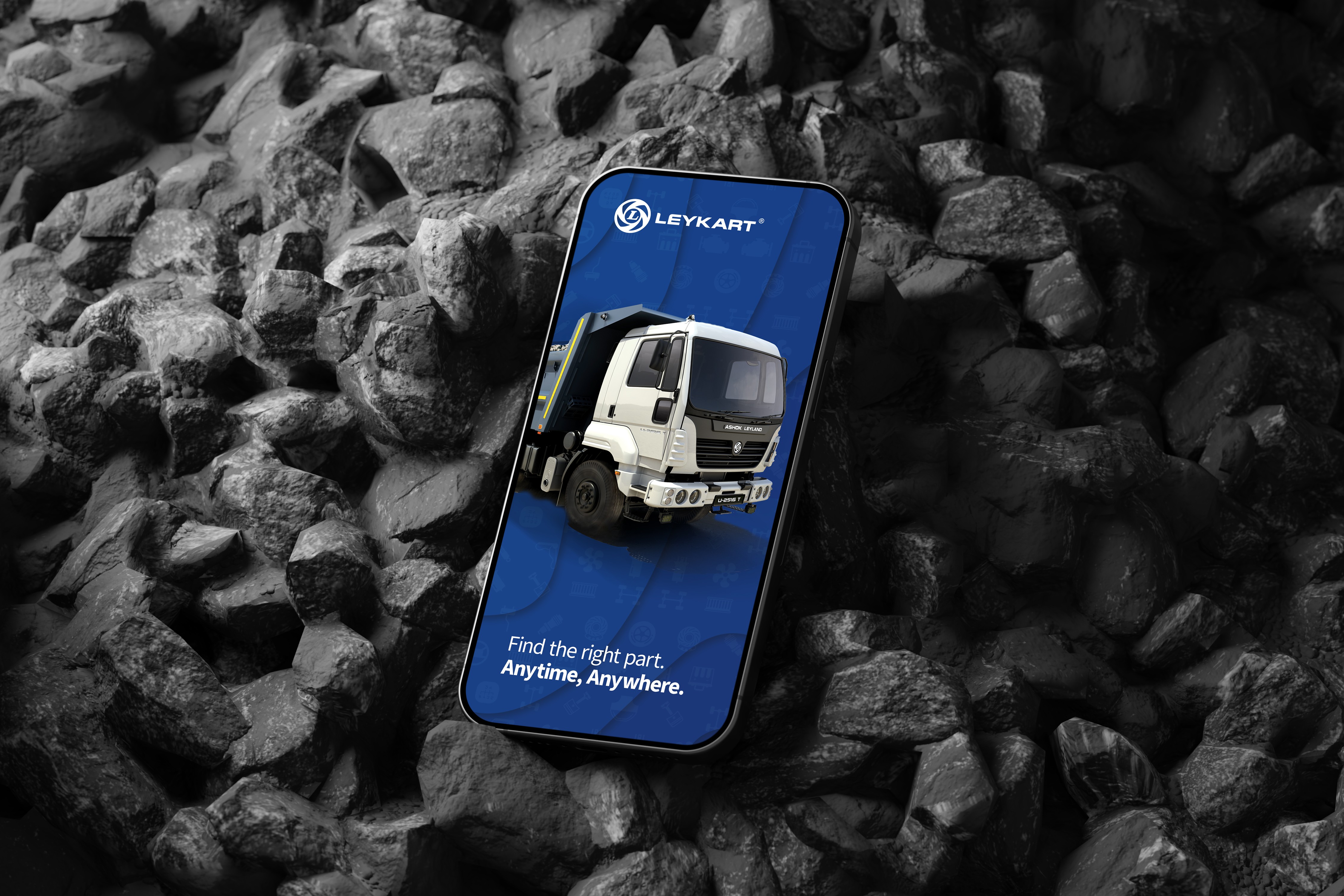
Customers drive the rapid adoption of connected digital solutions such as iAlert, Leykart and AL Care to reduce total cost of ownership (TCO).
Customers drive the rapid adoption of connected digital solutions such as iAlert, Leykart and AL Care to reduce total cost of ownership.
Customers drive the rapid adoption of connected digital solutions such as iAlert, Leykart and AL Care to reduce total cost of ownership.
Retrospective
What I learnt from the project?
Looking back, starting with a mobile-first design approach was one of the best decisions we made. This approach taught us an important lesson: designing within constraints early on not only simplifies the process but also makes it much easier to expand and improve the design later. It was a great reminder that sometimes, less really is more.
Looking back, starting with a mobile-first design approach was one of the best decisions we made. This approach taught us an important lesson: designing within constraints early on not only simplifies the process but also makes it much easier to expand and improve the design later. It was a great reminder that sometimes, less really is more.
Looking back, starting with a mobile-first design approach was one of the best decisions we made. This approach taught us an important lesson: designing within constraints early on not only simplifies the process but also makes it much easier to expand and improve the design later. It was a great reminder that sometimes, less really is more.
Looking back, starting with a mobile-first design approach was one of the best decisions we made. This approach taught us an important lesson: designing within constraints early on not only simplifies the process but also makes it much easier to expand and improve the design later. It was a great reminder that sometimes, less really is more.
I learned how to uncover user pain points, even when direct user interaction and feedback were limited. By collaborating with stakeholders and proxy users, we pieced together a clearer picture of user needs and challenges. Engaging with teams like support, sales, and other managers who work closely with customers provided valuable insights that helped fill in the gaps.
I learned how to uncover user pain points, even when direct user interaction and feedback were limited. By collaborating with stakeholders and proxy users, we pieced together a clearer picture of user needs and challenges. Engaging with teams like support, sales, and other managers who work closely with customers provided valuable insights that helped fill in the gaps.
I learned how to uncover user pain points, even when direct user interaction and feedback were limited. By collaborating with stakeholders and proxy users, we pieced together a clearer picture of user needs and challenges. Engaging with teams like support, sales, and other managers who work closely with customers provided valuable insights that helped fill in the gaps.
I learned how to uncover user pain points, even when direct user interaction and feedback were limited. By collaborating with stakeholders and proxy users, we pieced together a clearer picture of user needs and challenges. Engaging with teams like support, sales, and other managers who work closely with customers provided valuable insights that helped fill in the gaps.