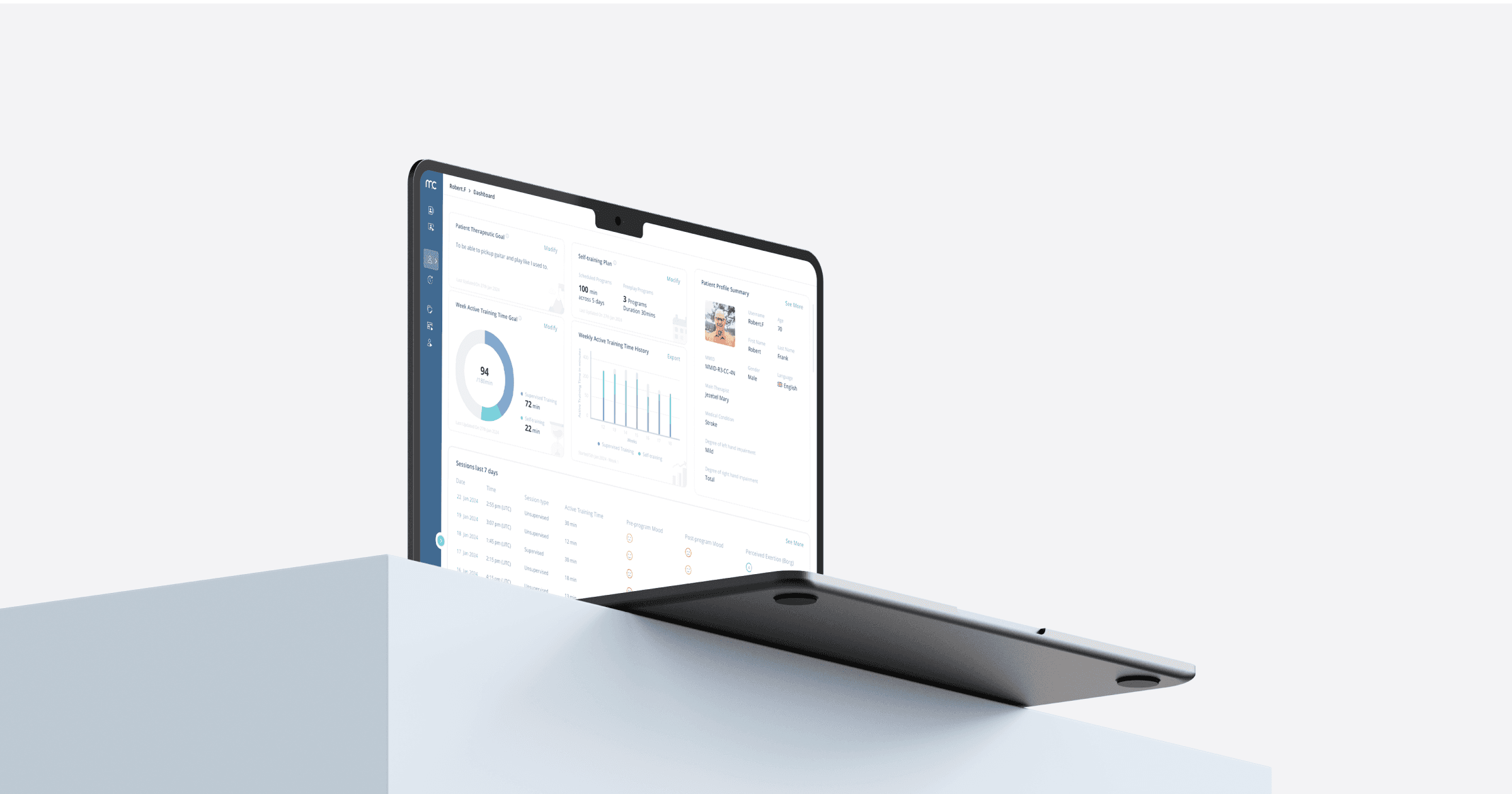
Optimized Planning & Navigation Workflow
Planning therapy sessions is essential for the rehabilitation of patients undergoing neurotherapy. MindMotion Companion empowers therapists to design customized programs, import existing ones, and schedule these sessions for multiple days in the week ahead.
Client:
MindMaze
Role:
UX/UI Designer
Year:
2024
Duration:
3 weeks
Client:
MindMaze
Role:
UX/UI Designer
Duration:
3 weeks
Year:
2024
Who, What and Why
Who are the users?
Therapists who give therapy to patients who suffers from neurological diseases like Parkinson’s, Alzheimer's, Acute Spinal Cord Injury, neuromuscular disorders etc.
Who are the users?
Therapists who give therapy to patients who suffers from neurological diseases like Parkinson’s, Alzheimer's, Acute Spinal Cord Injury, neuromuscular disorders etc.
Who are the users?
Therapists who give therapy to patients who suffers from neurological diseases like Parkinson’s, Alzheimer's, Acute Spinal Cord Injury, neuromuscular disorders etc.
What are user goals?
Making customized therapy programs or import existing program templates. Planning and scheduling therapy sessions for the patients for the upcoming week.
What are user goals?
Making customized therapy programs or import existing program templates. Planning and scheduling therapy sessions for the patients for the upcoming week.
What are user goals?
Making customized therapy programs or import existing program templates. Planning and scheduling therapy sessions for the patients for the upcoming week.
Who are the users?
Therapists who give therapy to patients who suffers from neurological diseases like Parkinson’s, Alzheimer's, Acute Spinal Cord Injury, neuromuscular disorders etc.
What are user goals?
Making customized therapy programs or import existing program templates. Planning and scheduling therapy sessions for the patients for the upcoming week.
Why redesign?
Users take too long to complete tasks due to errors and poor navigation. Since this page is crucial for customizing patient programs, usability improvements are needed.
Why redesign?
Users take too long to complete tasks due to errors and poor navigation. Since this page is crucial for customizing patient programs, usability improvements are needed.
Why redesign?
Users take too long to complete tasks due to errors and poor navigation. Since this page is crucial for customizing patient programs, usability improvements are needed.
Challenges
Project scope restricts altering the design system which lacks scalability.
Challenges
Project scope restricts altering the design system which lacks scalability.
Challenges
Project scope restricts altering the design system which lacks scalability.
Why redesign?
Users take too long to complete tasks due to errors and poor navigation. Since this page is crucial for customizing patient programs, usability improvements are needed.
Challenges
Project scope restricts altering the design system which lacks scalability.
Problem Discovery
Layout is not making optimal use of the space
UI elements are densely arranged not utilizing the available space around it
UI elements are densely arranged not utilizing the available space around it
UI elements are densely arranged not utilizing the available space around it
UI elements are densely arranged not utilizing the available space around it
Activity and program cards can be visually simplified
Activity and program cards can be visually simplified
Activity and program cards can be visually simplified
Activity and program cards can be visually simplified
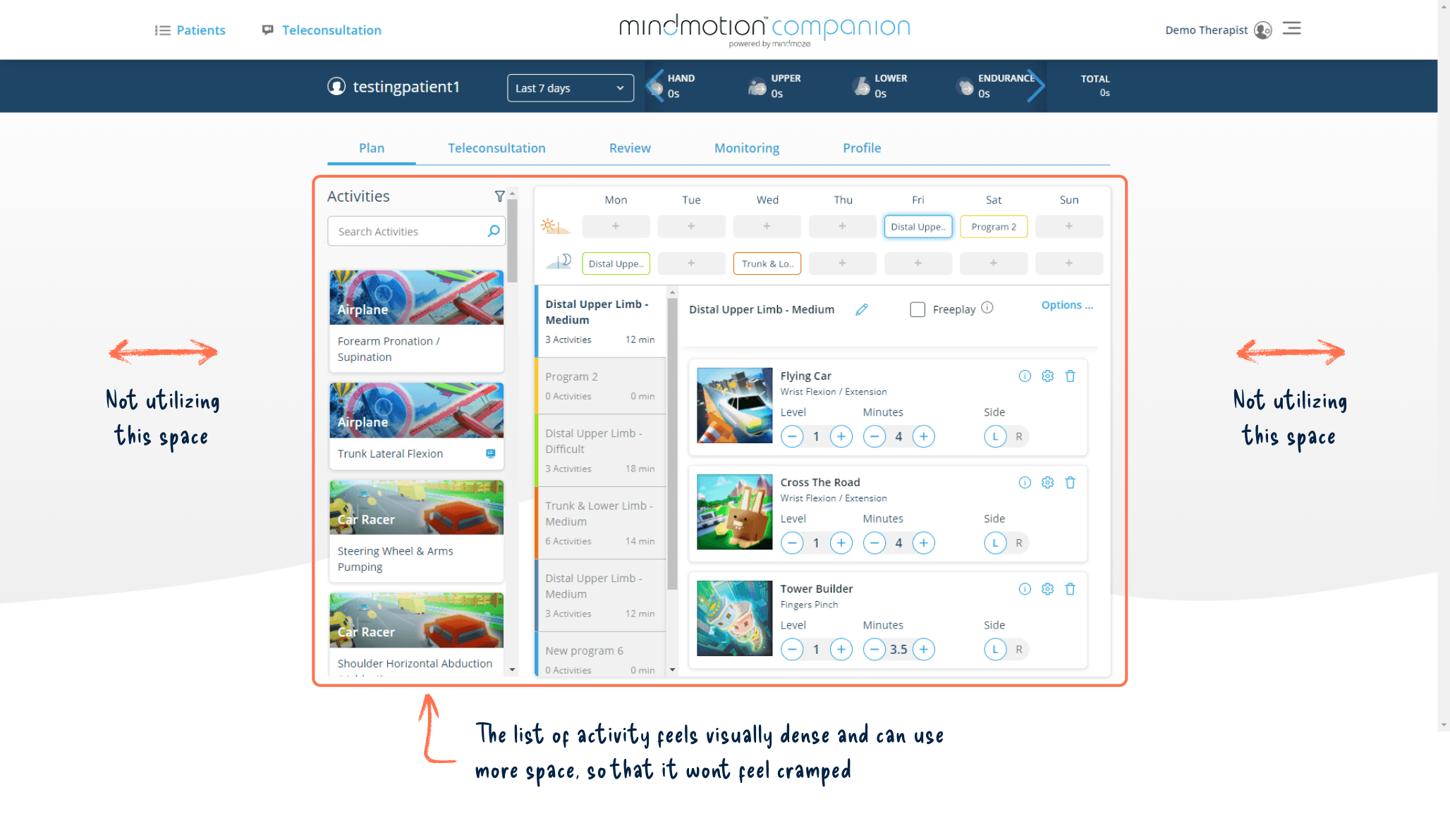
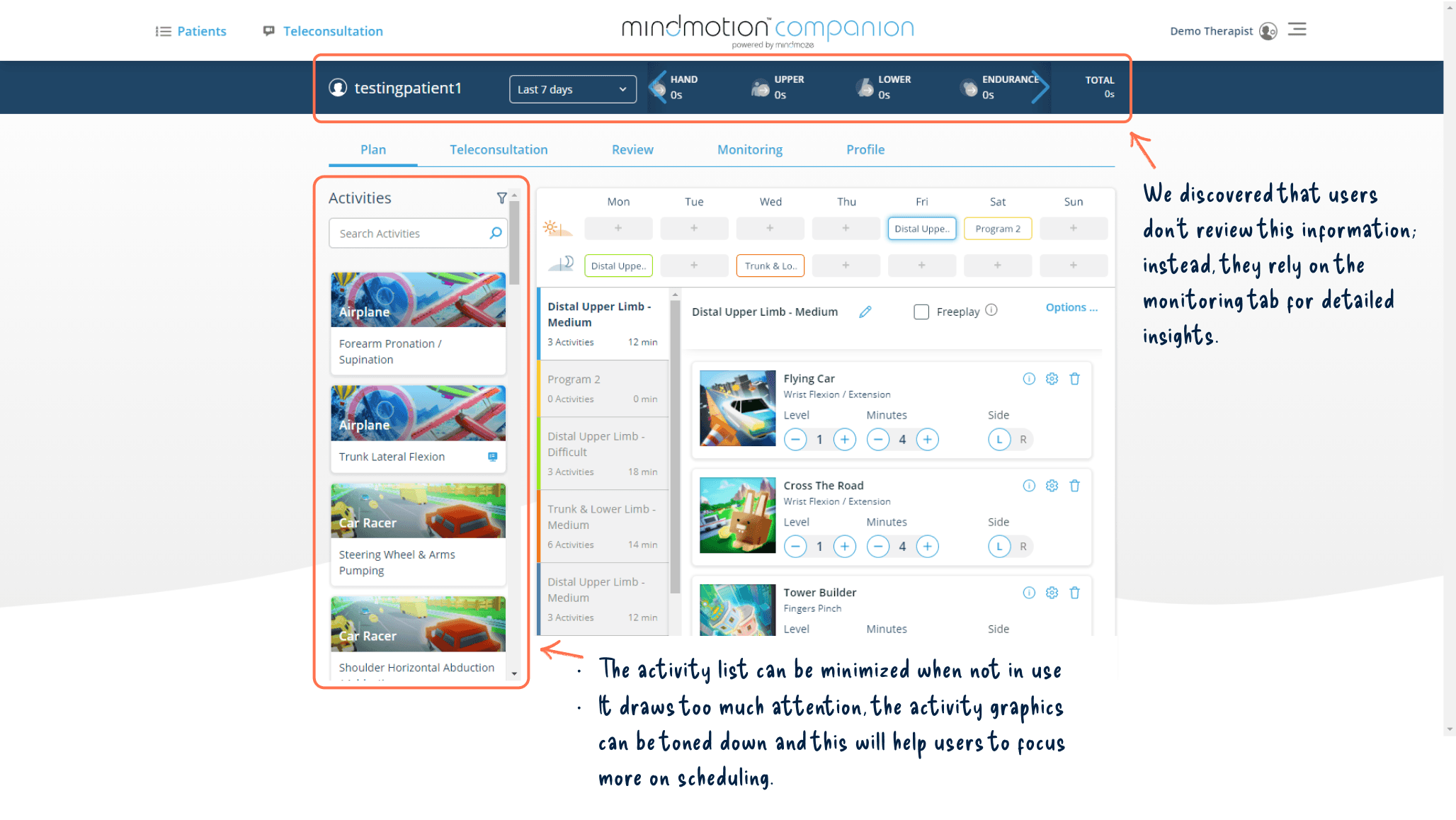
Elements that can be minimized to save space
Saving space is essential because users need to comfortably plan therapy session without errors
Saving space is essential because users need to comfortably plan therapy session without errors
Saving space is essential because users need to comfortably plan therapy session without errors
Saving space is essential because users need to comfortably plan therapy session without errors
The top bar takes lot of vertical spacing including the logo and the session-duration
The top bar takes lot of vertical spacing including the logo and the session-duration
The top bar takes lot of vertical spacing including the logo and the session-duration
The top bar takes lot of vertical spacing including the logo and the session-duration
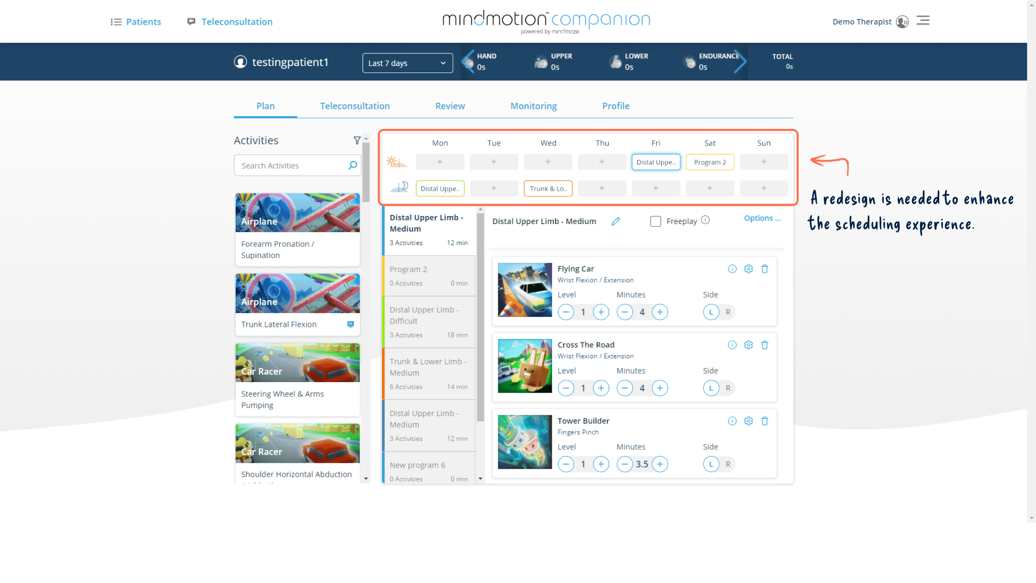
Planning therapy for the week needs improvement
Design of the therapy schedule lacks intuitiveness and sufficient visual importance
Design of the therapy schedule lacks intuitiveness and sufficient visual importance
Design of the therapy schedule lacks intuitiveness and sufficient visual importance
Design of the therapy schedule lacks intuitiveness and sufficient visual importance
It's tricky to show a program extending over many days as the slots are laid out vertically
It's tricky to show a program extending over many days as the slots are laid out vertically
It's tricky to show a program extending over many days as the slots are laid out vertically
It's tricky to show a program extending over many days as the slots are laid out vertically
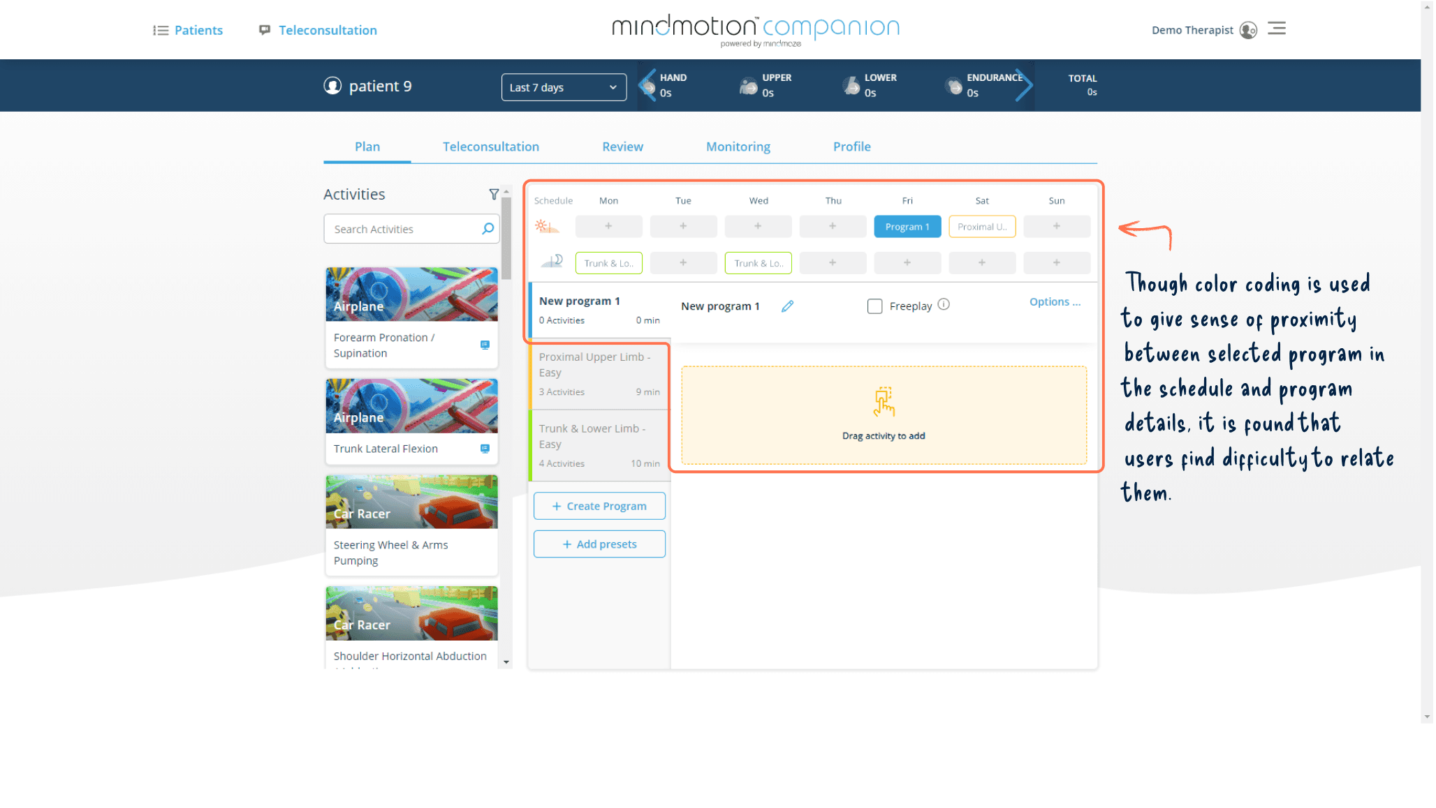
Challenging to associate the program with its details panel
The programs inside the schedule can be selected to add or remove or edit activities included in it, new users found difficulty to associate the selected program and its corresponding details panel.
The programs inside the schedule can be selected to add or remove or edit activities included in it, new users found difficulty to associate the selected program and its corresponding details panel.
The programs inside the schedule can be selected to add or remove or edit activities included in it, new users found difficulty to associate the selected program and its corresponding details panel.
The programs inside the schedule can be selected to add or remove or edit activities included in it, new users found difficulty to associate the selected program and its corresponding details panel.
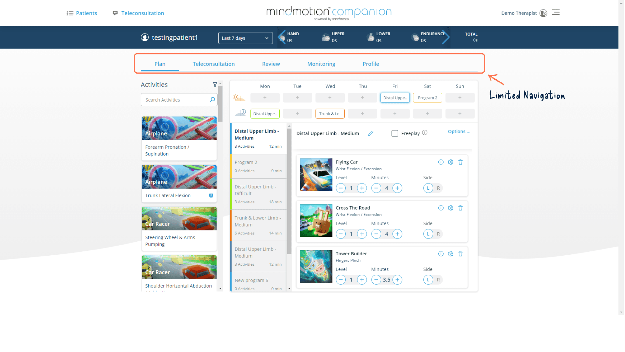
Navigation Limitations
Pages like Teleconsultation, Patients List, and Account Settings are not straight forward to navigate
Pages like Teleconsultation, Patients List, and Account Settings are not straight forward to navigate
Pages like Teleconsultation, Patients List, and Account Settings are not straight forward to navigate
Pages like Teleconsultation, Patients List, and Account Settings are not straight forward to navigate
The navigation framework must have the adaptability to incorporate future features currently in the pipeline
The navigation framework must have the adaptability to incorporate future features currently in the pipeline
The navigation framework must have the adaptability to incorporate future features currently in the pipeline
The navigation framework must have the adaptability to incorporate future features currently in the pipeline
Final Outcome
After multiple usability testing and iterations, designs were developed and rolled out to the users
Usability tests with new users helped assess the learning curve across design iterations.
Usability tests with new users helped assess the learning curve across design iterations.
Usability tests with new users helped assess the learning curve across design iterations.
Usability tests with new users helped assess the learning curve across design iterations.
The planning screen was redesigned within existing design system constraints.
The planning screen was redesigned within existing design system constraints.
The planning screen was redesigned within existing design system constraints.
The planning screen was redesigned within existing design system constraints.
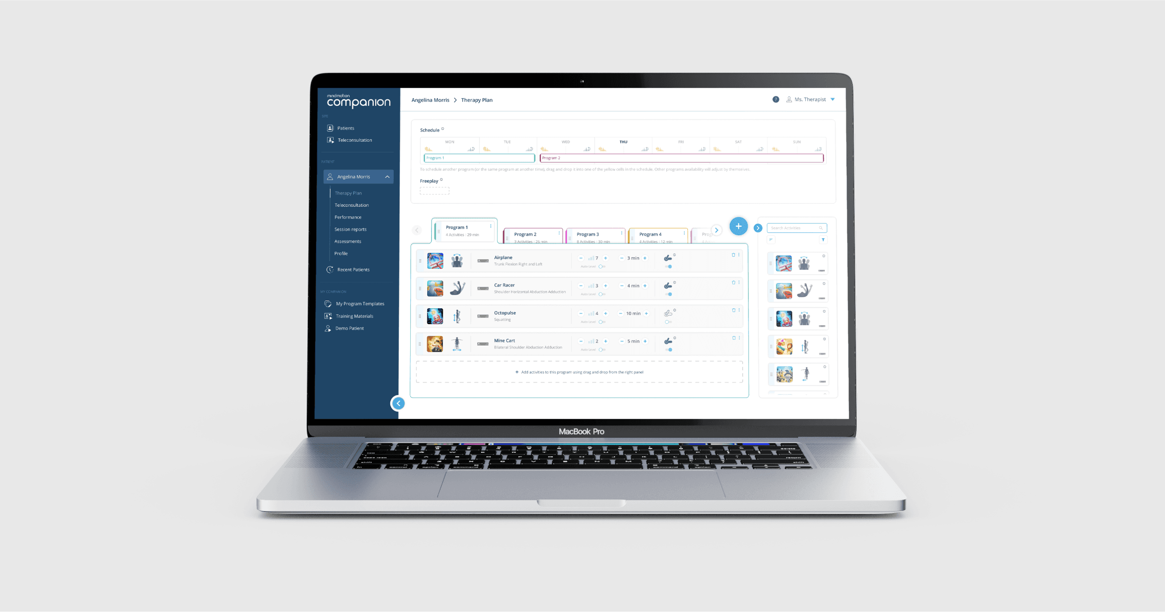
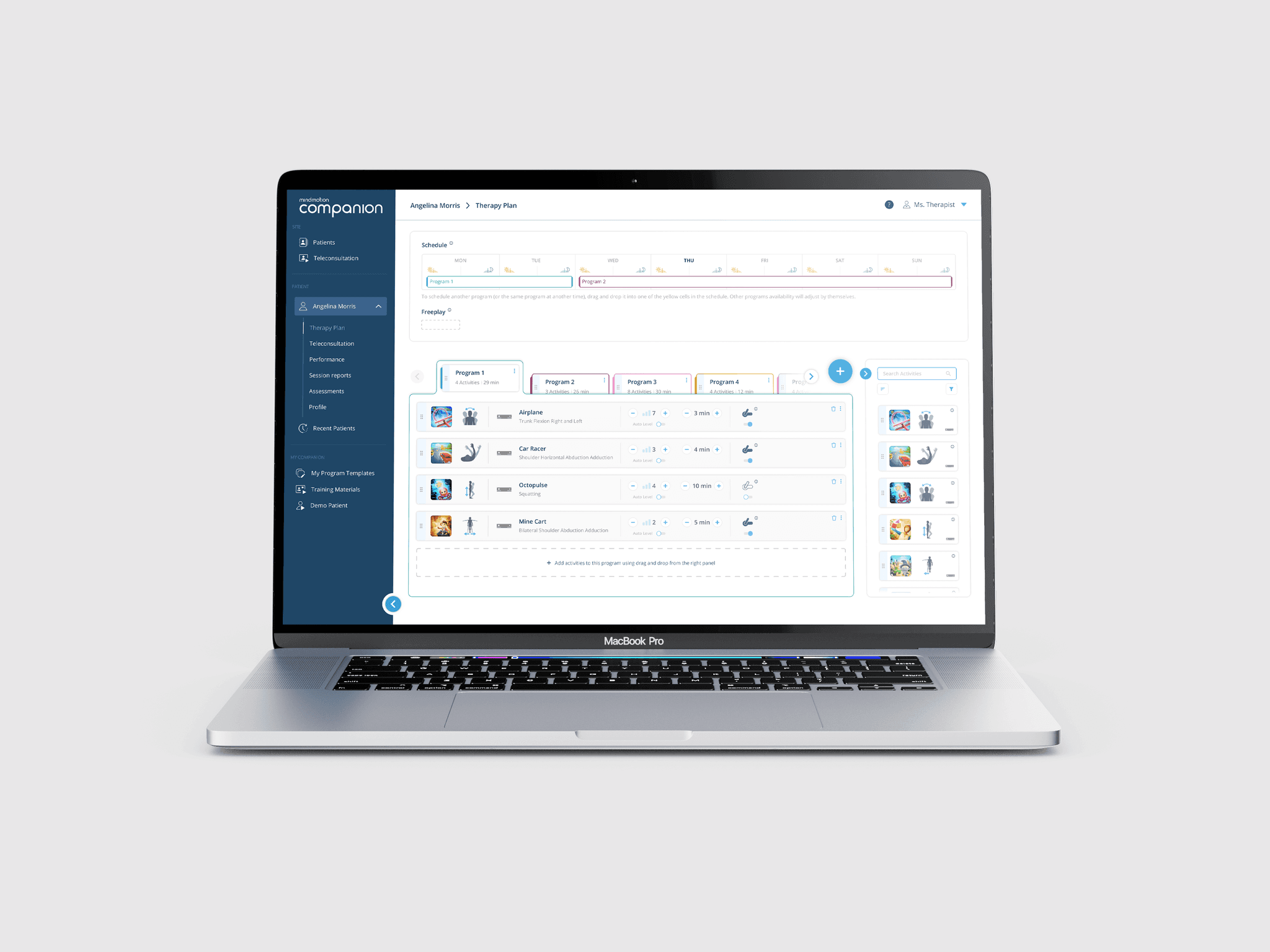
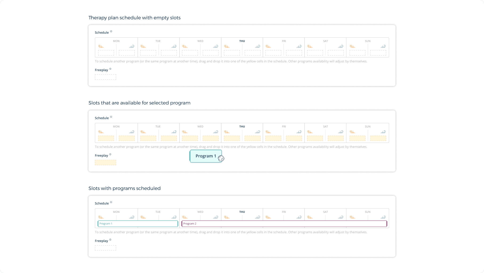
Redesigned schedule slots
The schedule slots, tinted in yellow, indicate that these slots are open for dragging and dropping programs.
The schedule slots, tinted in yellow, indicate that these slots are open for dragging and dropping programs.
The schedule slots, tinted in yellow, indicate that these slots are open for dragging and dropping programs.
The schedule slots, tinted in yellow, indicate that these slots are open for dragging and dropping programs.
Arranging schedule slots horizontally helped to display the continuity of a program from one day to the next.
Arranging schedule slots horizontally helped to display the continuity of a program from one day to the next.
Arranging schedule slots horizontally helped to display the continuity of a program from one day to the next.
Arranging schedule slots horizontally helped to display the continuity of a program from one day to the next.
Program list designed as tabs
Programs are arranged horizontally in tabs. Using a color coded outline each program neatly encompasses its activities and its controls in the form of cards.
Programs are arranged horizontally in tabs. Using a color coded outline each program neatly encompasses its activities and its controls in the form of cards.
Programs are arranged horizontally in tabs. Using a color coded outline each program neatly encompasses its activities and its controls in the form of cards.
Programs are arranged horizontally in tabs. Using a color coded outline each program neatly encompasses its activities and its controls in the form of cards.
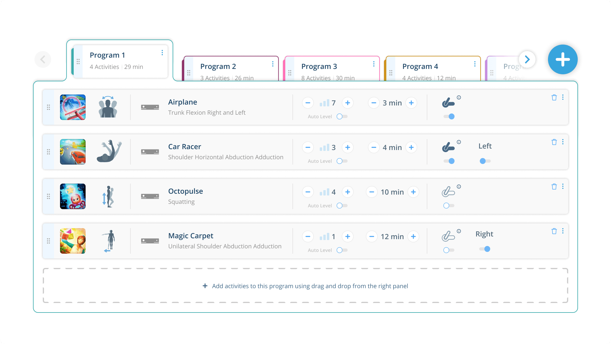
Dragging & dropping behaviour
Arranging the program cards in horizontal tabs enhances drag-and-drop precision in the scheduling slots for users.
Arranging the program cards in horizontal tabs enhances drag-and-drop precision in the scheduling slots for users.
Arranging the program cards in horizontal tabs enhances drag-and-drop precision in the scheduling slots for users.
Arranging the program cards in horizontal tabs enhances drag-and-drop precision in the scheduling slots for users.
Color codes are more recognizable now and helps users to relate the programs in the schedule panel and its details below.
Color codes are more recognizable now and helps users to relate the programs in the schedule panel and its details below.
Color codes are more recognizable now and helps users to relate the programs in the schedule panel and its details below.
Color codes are more recognizable now and helps users to relate the programs in the schedule panel and its details below.
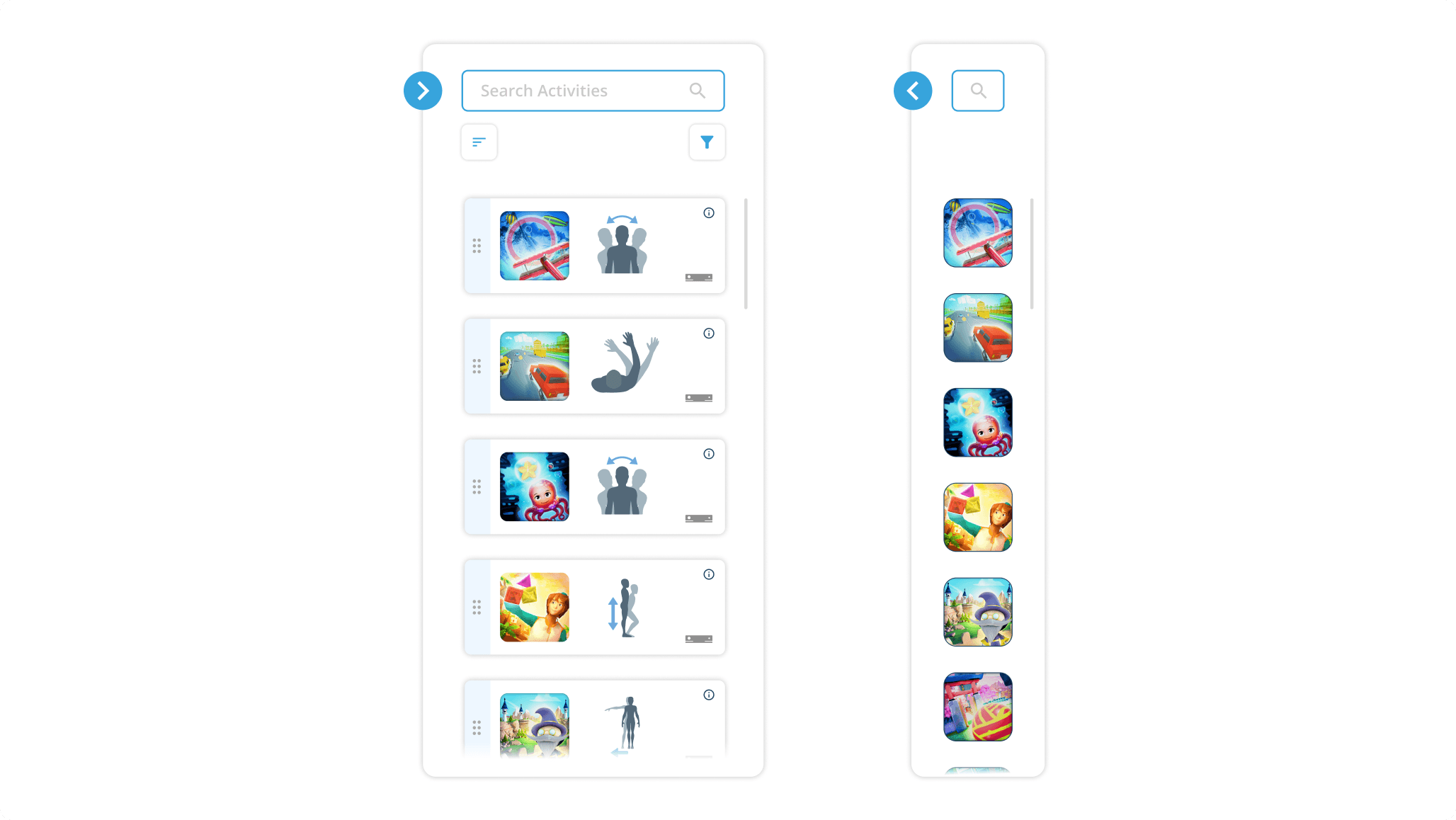
Activity list panel redesign
Through user tests, we discovered that users recognize the activities by referring it's game environment images and movement icons. This understanding enabled us to improve the activity card without text contents.
Through user tests, we discovered that users recognize the activities by referring it's game environment images and movement icons. This understanding enabled us to improve the activity card without text contents.
Through user tests, we discovered that users recognize the activities by referring it's game environment images and movement icons. This understanding enabled us to improve the activity card without text contents.
Through user tests, we discovered that users recognize the activities by referring it's game environment images and movement icons. This understanding enabled us to improve the activity card without text contents.
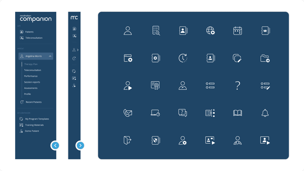
Adaptable sidebar navigation
Designed navigation bar with custom icons that can expand and collapse.
Designed navigation bar with custom icons that can expand and collapse.
Designed navigation bar with custom icons that can expand and collapse.
Designed navigation bar with custom icons that can expand and collapse.
This proved that users can now navigate through all the pages easily.
This proved that users can now navigate through all the pages easily.
This proved that users can now navigate through all the pages easily.
This proved that users can now navigate through all the pages easily.
Redesigned therapy plan page
Usability assessments were independently conducted for novice and experienced users, each set performing unique tasks.
Usability assessments were independently conducted for novice and experienced users, each set performing unique tasks.
Usability assessments were independently conducted for novice and experienced users, each set performing unique tasks.
Usability assessments were independently conducted for novice and experienced users, each set performing unique tasks.
Usability studies were done with KPIs such as time on tasks, use of navigation, error rates and drop-off rates. Iterations were done based on the results from these tests.
Usability studies were done with KPIs such as time on tasks, use of navigation, error rates and drop-off rates. Iterations were done based on the results from these tests.
Usability studies were done with KPIs such as time on tasks, use of navigation, error rates and drop-off rates. Iterations were done based on the results from these tests.
Usability studies were done with KPIs such as time on tasks, use of navigation, error rates and drop-off rates. Iterations were done based on the results from these tests.
Retrospective
What I learnt from the project?
Swift client feedback allowed me to promptly examine, compose, and deliver proposals quicker
Swift client feedback allowed me to promptly examine, compose, and deliver proposals quicker
Swift client feedback allowed me to promptly examine, compose, and deliver proposals quicker
Swift client feedback allowed me to promptly examine, compose, and deliver proposals quicker
Build-Measure-Learn iterative cycle helped to assess project risks and design efficiently
Build-Measure-Learn iterative cycle helped to assess project risks and design efficiently
Build-Measure-Learn iterative cycle helped to assess project risks and design efficiently
Build-Measure-Learn iterative cycle helped to assess project risks and design efficiently
I discovered that teamwork open up to different views, that will eventually lead to creative solutions
I discovered that teamwork open up to different views, that will eventually lead to creative solutions
I discovered that teamwork open up to different views, that will eventually lead to creative solutions
I discovered that teamwork open up to different views, that will eventually lead to creative solutions